ZARA
ZARA
ZARA
A refined shopping experience designed to enhance user engagement for Zara.
A refined shopping experience designed to enhance user engagement for Zara.
A refined shopping experience designed to enhance user engagement for Zara.
PROJECT overview
PROJECT overview
PROJECT overview
Have you ever shopped online at Zara and felt frustrated by the interface? If so, you're not alone. Drawing from the experiences of Zara's most dedicated shoppers, I took on the challenge of redesigning their online experience, aiming to make it smoother and more intuitive, while staying true to the brand's iconic image.
Have you ever shopped online at Zara and felt frustrated by the interface? If so, you're not alone. Drawing from the experiences of Zara's most dedicated shoppers, I took on the challenge of redesigning their online experience, aiming to make it smoother and more intuitive, while staying true to the brand's iconic image.
Have you ever shopped online at Zara and felt frustrated by the interface? If so, you're not alone. Drawing from the experiences of Zara's most dedicated shoppers, I took on the challenge of redesigning their online experience, aiming to make it smoother and more intuitive, while staying true to the brand's iconic image.
TIMEFRAME
TIMEFRAME
TIMEFRAME
June - Jul 2024
(5 weeks)
June - Jul 2024
(5 weeks)
June - Jul 2024
(5 weeks)
PROJECT TYPE
PROJECT TYPE
PROJECT TYPE
Desktop-first responsive site, redesign of an E-commerce fashion retail.
Desktop-first responsive site, redesign of an E-commerce fashion retail.
Desktop-first responsive site, redesign of an E-commerce fashion retail.
ROLE
ROLE
ROLE
Research, Interaction Design, Prototyping, Testing
Research, Interaction Design, Prototyping, Testing
Research, Interaction Design, Prototyping, Testing
Initial Problem Discovery
Initial Problem Discovery
Initial Problem Discovery
Initial Problem Discovery
what problems are there to solve?
what problems are there to solve?
what problems are there to solve?

Shoppers struggle with limited usability & functionality on Zara's site. 👩💻
Shoppers struggle with limited usability & functionality on Zara's site. 👩💻
Shoppers struggle with limited usability & functionality on Zara's site. 👩💻
Picture this — You're browsing Zara's website, excited to shop, but instead, you're met with a cluttered interface & confusing navigation. What should be a seamless experience quickly turns into a frustrating challenge.
Picture this — You're browsing Zara's website, excited to shop, but instead, you're met with a cluttered interface & confusing navigation. What should be a seamless experience quickly turns into a frustrating challenge.
Picture this — You're browsing Zara's website, excited to shop, but instead, you're met with a cluttered interface & confusing navigation. What should be a seamless experience quickly turns into a frustrating challenge.
Understanding Problem Significance
Understanding Problem Significance
Understanding Problem Significance
Understanding Problem Significance
WHY IS THIS PROBLEM IMPORTANT?
WHY IS THIS PROBLEM IMPORTANT?
WHY IS THIS PROBLEM IMPORTANT?
WHY IS THIS PROBLEM IMPORTANT?
It diminishes users' shopping experience, which could harm brand loyalty.
It diminishes users' shopping experience, which could harm brand loyalty.
It diminishes users' shopping experience, which could harm brand loyalty.
🙎♀️
🙎♀️
🙎♀️
"One of the major frustrations that customers often encounter is its confusing user interface."
"One of the major frustrations that customers often encounter is its confusing user interface."
"One of the major frustrations that customers often encounter is its confusing user interface."
🤷♀️
🤷♀️
🤷♀️
"It is very difficult to understand what is the message Zara is trying to communicate."
"It is very difficult to understand what is the message Zara is trying to communicate."
"It is very difficult to understand what is the message Zara is trying to communicate."
🤦♀️
🤦♀️
🤦♀️
"They've built perhaps the worst online shopping experience I've ever used."
"They've built perhaps the worst online shopping experience I've ever used."
"They've built perhaps the worst online shopping experience I've ever used."
👀 Could it really be as they say? 👀
👀 Could it really be as they say? 👀
👀 Could it really be as they say? 👀
(After gathering all the secondary research, I needed to experience Zara's site firsthand to understand why users felt this way—and what I found left no doubt. ⬇️)
(After gathering all the secondary research, I needed to experience Zara's site firsthand to understand why users felt this way—and what I found left no doubt. ⬇️)
(After gathering all the secondary research, I needed to experience Zara's site firsthand to understand why users felt this way—and what I found left no doubt. ⬇️)
Thanks, Internet. 🙂
Thanks, Internet. 🙂
Thanks, Internet. 🙂
Thanks, Internet. 🙂
Now that this is a known issue, it's time to uncover the root causes behind these challenges.
Now that this is a known issue, it's time to uncover the root causes behind these challenges.
Now that this is a known issue, it's time to uncover the root causes behind these challenges.
Research Methods. Time to look for answers
Research Methods. Time to look for answers
Research Methods. Time to look for answers
Research Methods. Time to look for answers
What UX research methods will uncover zara's design issues and guide my solution? 🤷♀️
What UX research methods will uncover zara's design issues and guide my solution? 🤷♀️
What UX research methods will uncover zara's design issues and guide my solution? 🤷♀️
UX RESEARCH METHODS 01 & 02: SURVEYS > USER INTERVIEWS
UX RESEARCH METHODS 01 & 02: SURVEYS > USER INTERVIEWS
UX RESEARCH METHODS 01 & 02: SURVEYS > USER INTERVIEWS
I sent out a survey to 8 shoppers, followed by user interviews with 5 others.
I sent out a survey to 8 shoppers, followed by user interviews with 5 others.
I sent out a survey to 8 shoppers, followed by user interviews with 5 others.
The goal of combining these methods was to gain a clearer picture of the specific pain points online shoppers face on Zara's site, leading to a better understanding of the issues.
The goal of combining these methods was to gain a clearer picture of the specific pain points online shoppers face on Zara's site, leading to a better understanding of the issues.
The goal of combining these methods was to gain a clearer picture of the specific pain points online shoppers face on Zara's site, leading to a better understanding of the issues.
🔍 FINDINGS
🔍 FINDINGS
🔍 FINDINGS
77%
77%
77%
Found it difficult to navigate the site due to unintuitive layout & poor content structure.
Found it difficult to navigate the site due to unintuitive layout & poor content structure.
Found it difficult to navigate the site due to unintuitive layout & poor content structure.
62%
62%
62%
Found the existing filter features lacking, desiring for more comprehensive options to refine searches.
Found the existing filter features lacking, desiring for more comprehensive options to refine searches.
Found the existing filter features lacking, desiring for more comprehensive options to refine searches.

69%
69%
69%
Felt that there were insufficient product information on reviews and fit, causing indecisiveness.
Felt that there were insufficient product information on reviews and fit, causing indecisiveness.
Felt that there were insufficient product information on reviews and fit, causing indecisiveness.
HYPOTHESIS STATEMENT (so what? 🧐)
HYPOTHESIS STATEMENT (so what? 🧐)
HYPOTHESIS STATEMENT (so what? 🧐)
If I enable a way for shoppers to easily browse and access information, their online shopping experience will be more seamless and satisfying.
If I enable a way for shoppers to easily browse and access information, their online shopping experience will be more seamless and satisfying.
If I enable a way for shoppers to easily browse and access information, their online shopping experience will be more seamless and satisfying.
Understanding Target Audience
Understanding Target Audience
Understanding Target Audience
Understanding Target Audience
whose PROBLEM AM I SOLVING?
whose PROBLEM AM I SOLVING?
whose PROBLEM AM I SOLVING?
whose PROBLEM AM I SOLVING?
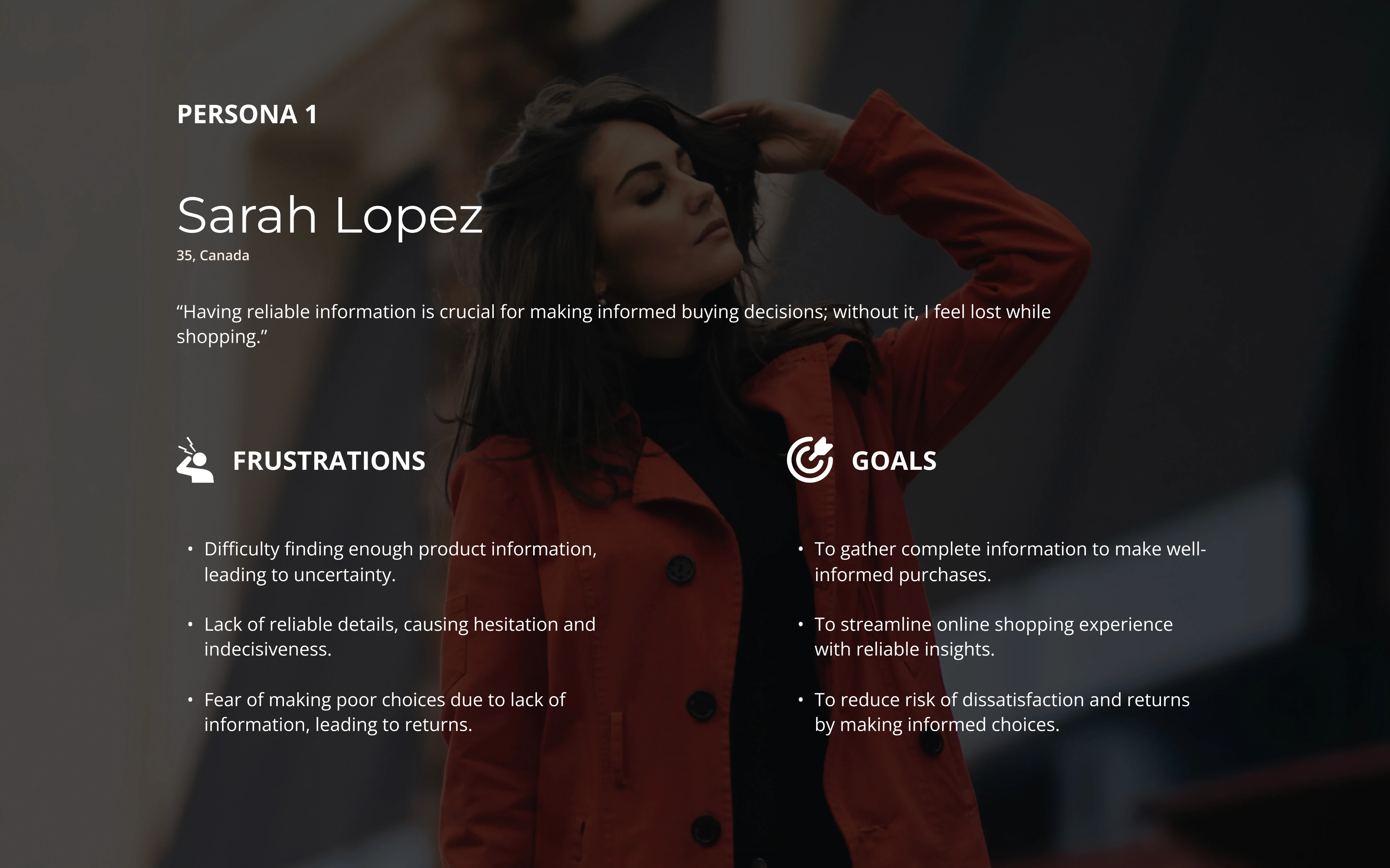
Hassle-free enthusiasts who value clarity and ease. 🛒🎯
Hassle-free enthusiasts who value clarity and ease. 🛒🎯
Hassle-free enthusiasts who value clarity and ease. 🛒🎯
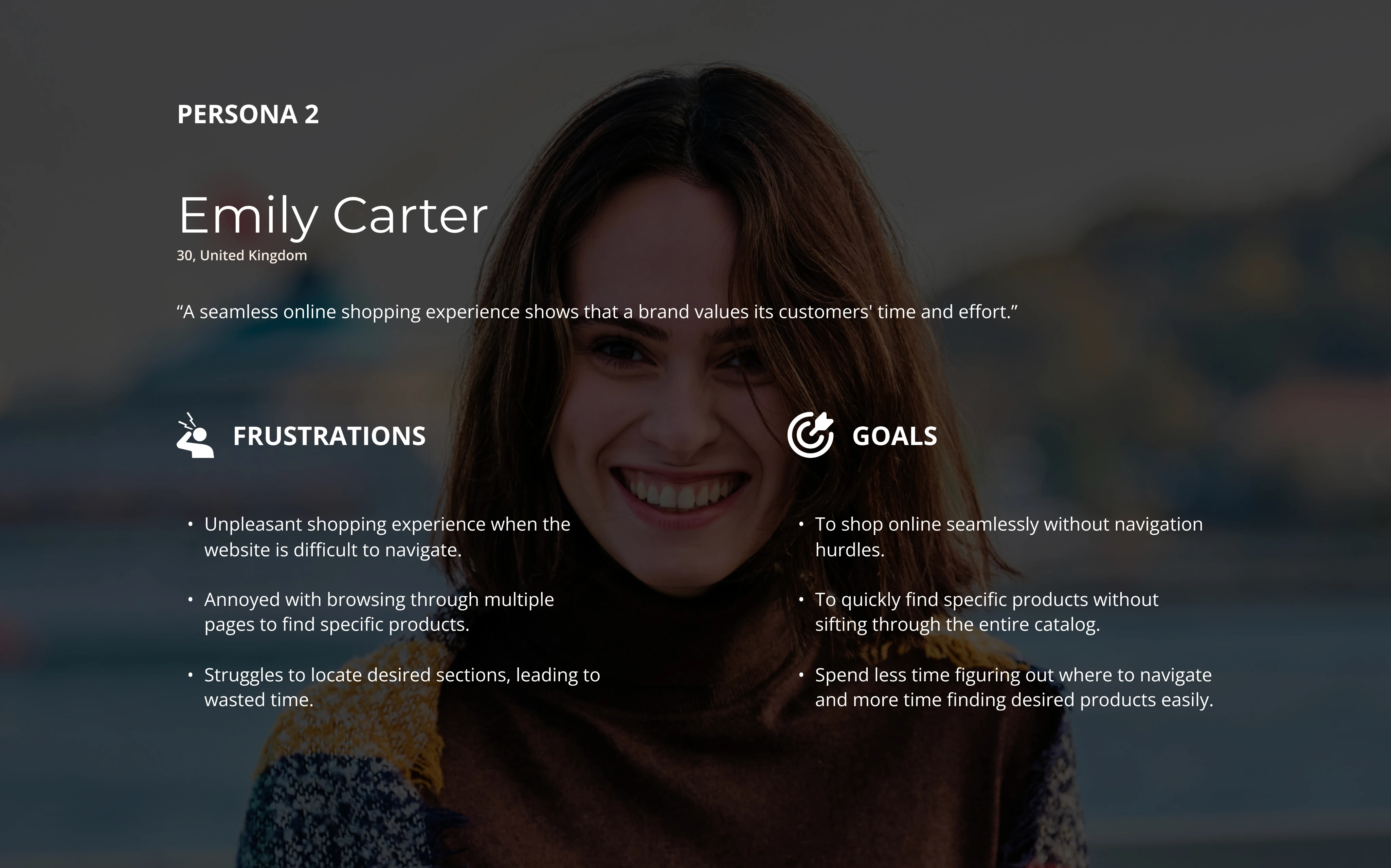

Design Goals
Design Goals
Design Goals
Design Goals
🔑 KEY PROBLEM AREAs
🔑 KEY PROBLEM AREAs
🔑 KEY PROBLEM AREAs
Users need a smoother navigation experience.
😀
Users need a smoother navigation experience.
😀
Users need a smoother navigation experience.
😀
Users struggle to find specific products due to limited functionality.
💻 😕
Users struggle to find specific products due to limited functionality.
💻 😕
Users struggle to find specific products due to limited functionality.
💻 😕
Users want reliable information to confidently make purchase decisions.
🗣️ℹ️
Users want reliable information to confidently make purchase decisions.
🗣️ℹ️
Users want reliable information to confidently make purchase decisions.
🗣️ℹ️
The Solution! Tada 🥳
The Solution! Tada 🥳
The Solution! Tada 🥳
The Solution! Tada 🥳
A desktop-first design that provides a seamless shopping experience. 💻
A desktop-first design that provides a seamless shopping experience. 💻
A desktop-first design that provides a seamless shopping experience. 💻

Seamless
Seamless
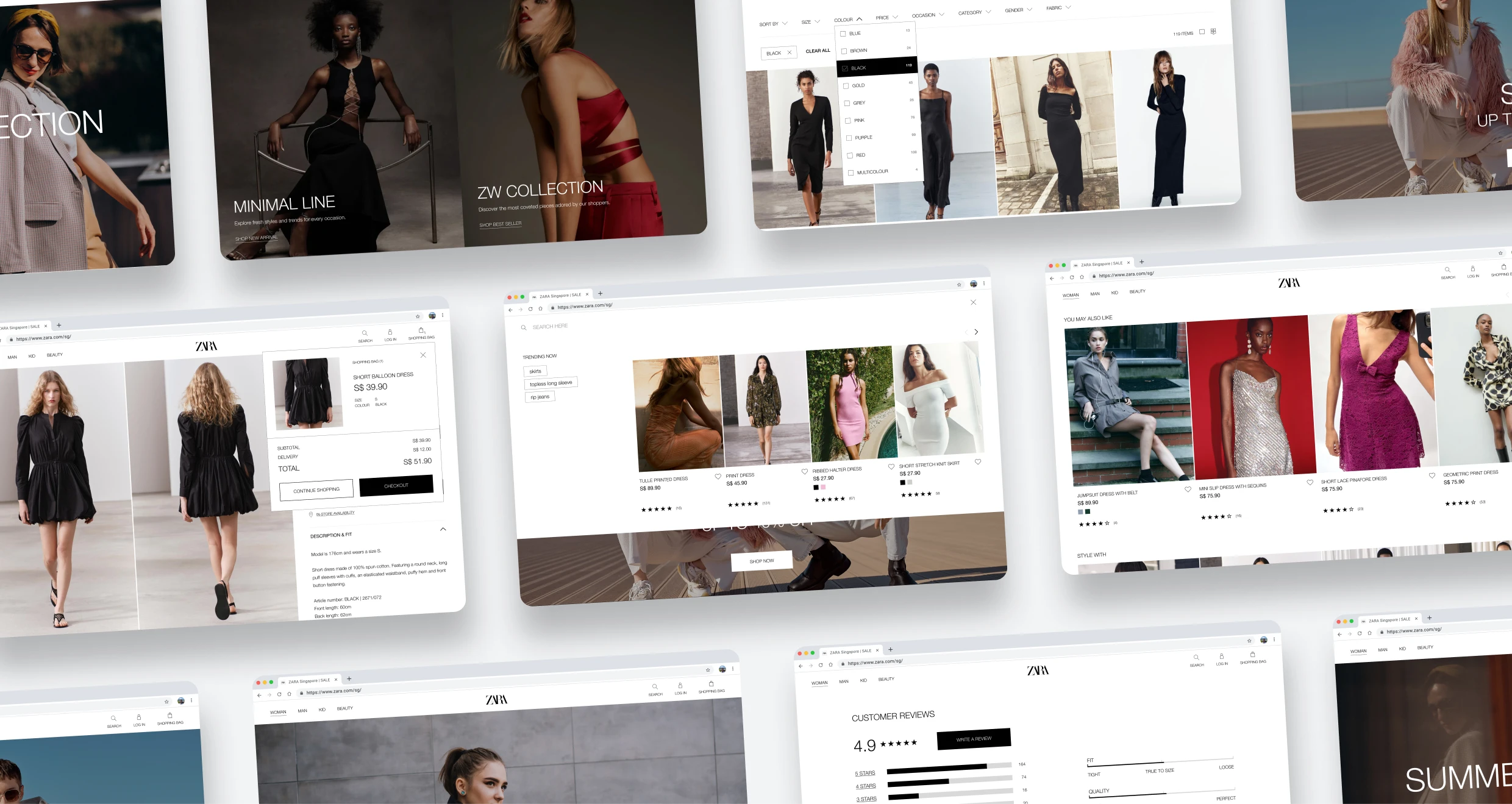
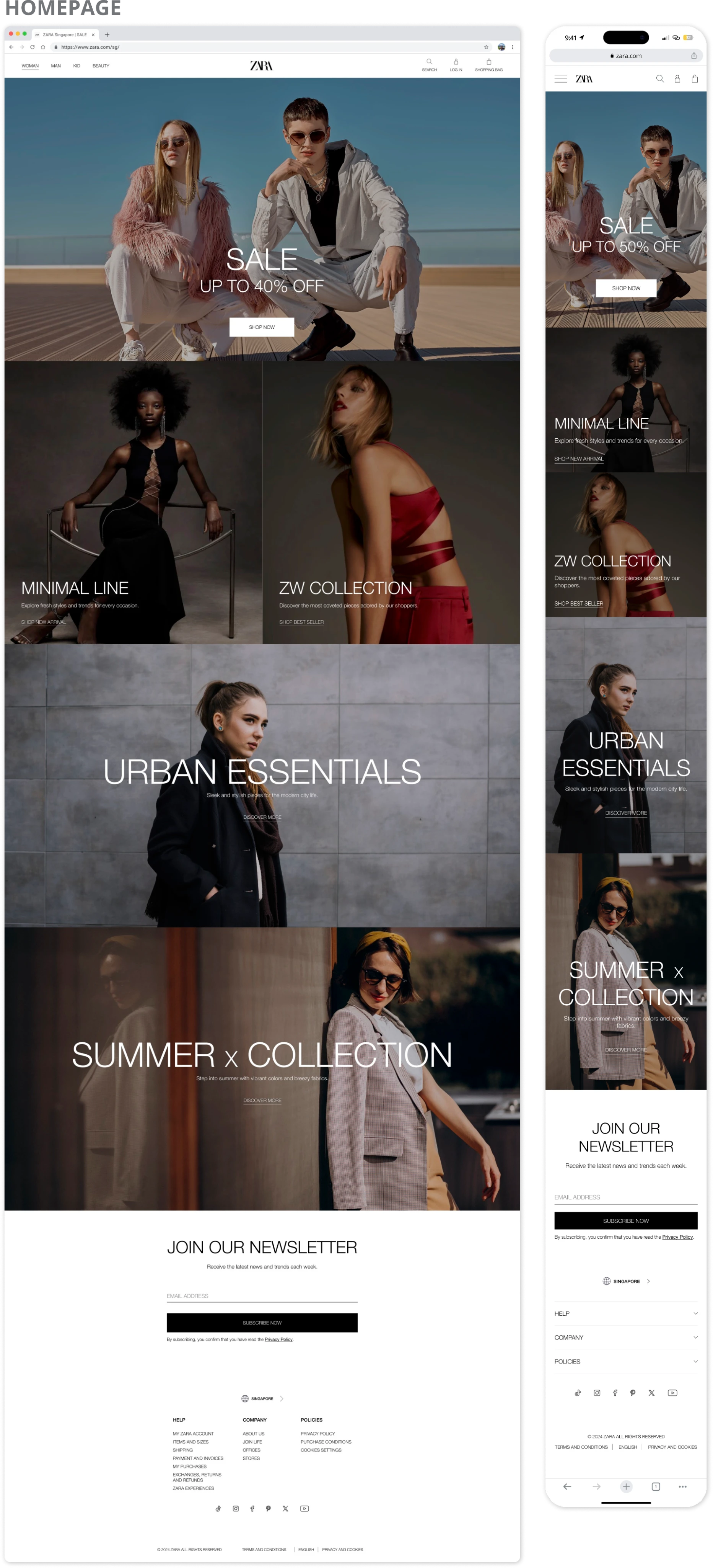
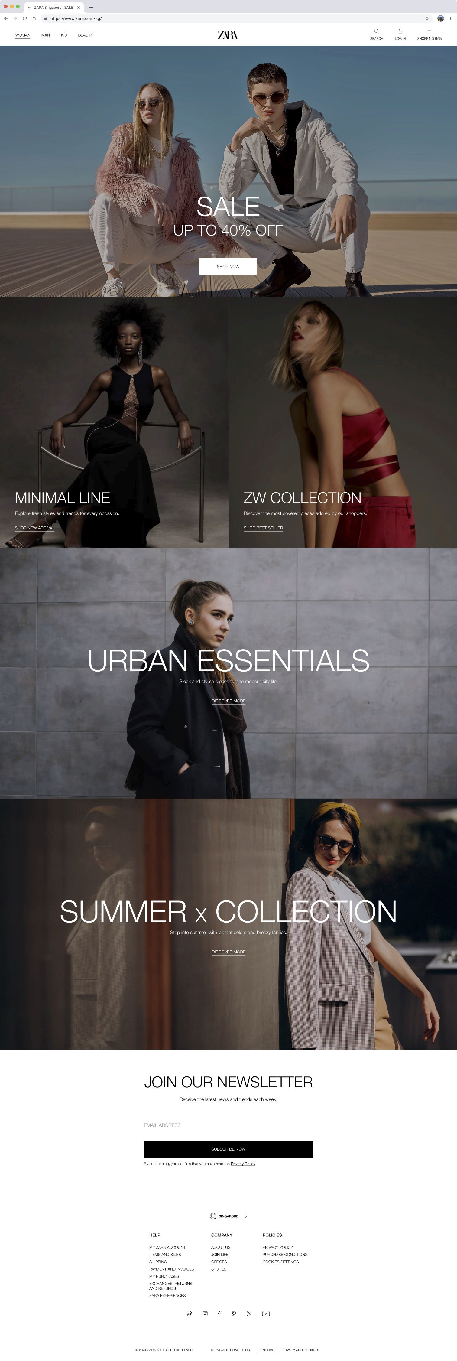
homepage (before)
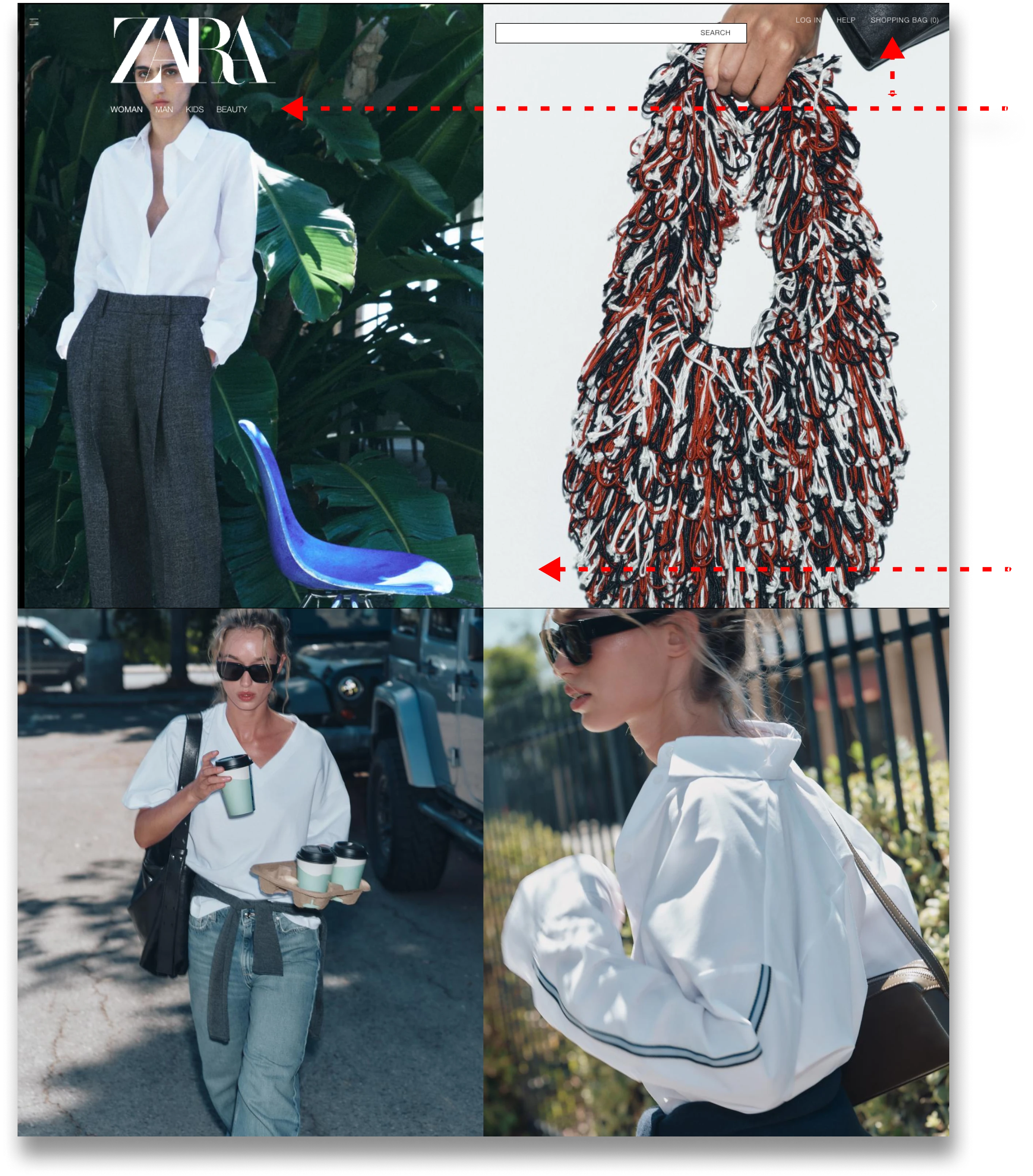
❌ Unreadable Header Menu
❌ Unreadable Header Menu
White text over images makes the header menu hard to read & navigate. The oversized Zara logo also obstructs important elements during scrolling.
White text over images makes the header menu hard to read & navigate. The oversized Zara logo also obstructs important elements during scrolling.
❌ Lack of Clear CTAs
❌ Lack of Clear CTAs
The absence of CTA buttons leaves users uncertain about where to click or how to navigate, resulting in confusion & a poor user experience.
The absence of CTA buttons leaves users uncertain about where to click or how to navigate, resulting in confusion & a poor user experience.
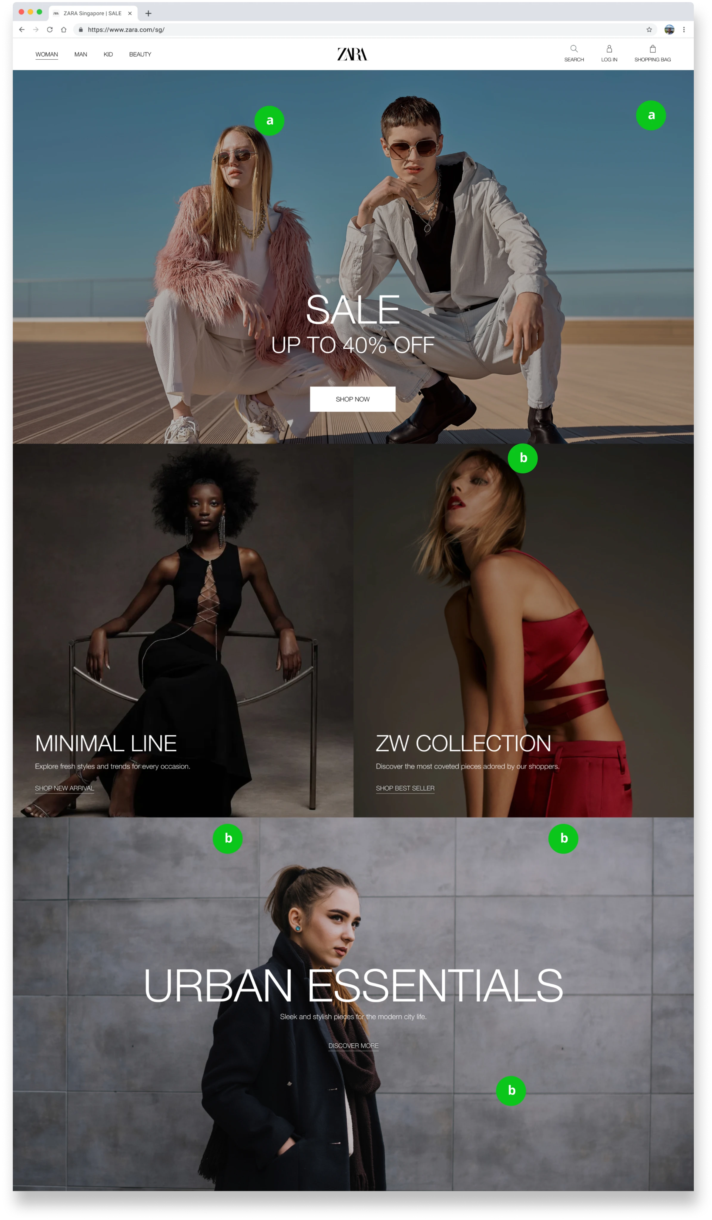
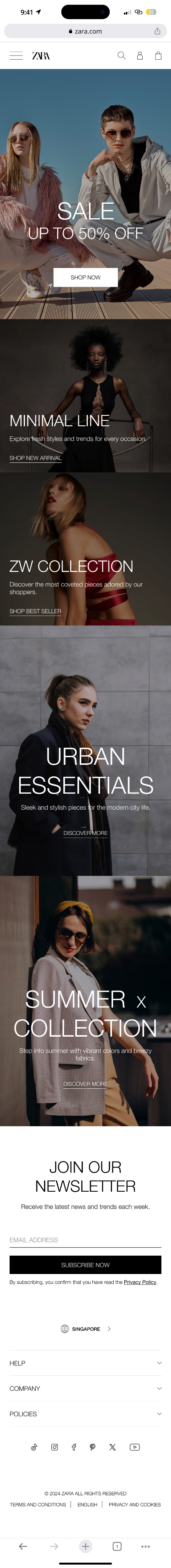
homepage (after)

✅ Enhanced Readability
✅ Enhanced Readability
Switched to black text on a white background & added icons to improve readability. The logo size was reduced to prevent obstruction, allowing smoother navigation.
Switched to black text on a white background & added icons to improve readability. The logo size was reduced to prevent obstruction, allowing smoother navigation.
✅ Clear Navigation
✅ Clear Navigation
Redesigned the layout with structured categorized sections, along with prominent CTAs, guiding users effectively & improving their overall experience.
(Time to finish task was quicker!)
Redesigned the layout with structured categorized sections, along with prominent CTAs, guiding users effectively & improving their overall experience.
(Time to finish task was quicker!)
Seamless
homepage (before)

a) ❌ Unreadable Header Menu
White text over images makes the header menu hard to read & navigate. The oversized Zara logo also obstructs important elements during scrolling.
b) ❌ Lack of Clear CTAs
The absence of CTA buttons leaves users uncertain about where to click or how to navigate, resulting in confusion & a poor user experience.
homepage (after)
a) ✅ Enhanced Readability
Switched to black text on a white background & added icons to improve readability. The logo size was reduced to prevent obstruction, allowing smoother navigation.
b) ✅ Clear Navigation
Redesigned the layout with structured categorized sections, along with prominent CTAs, guiding users effectively & improving their overall experience.
(Time to finish task was quicker!)

Personalized
Personalized
Personalized
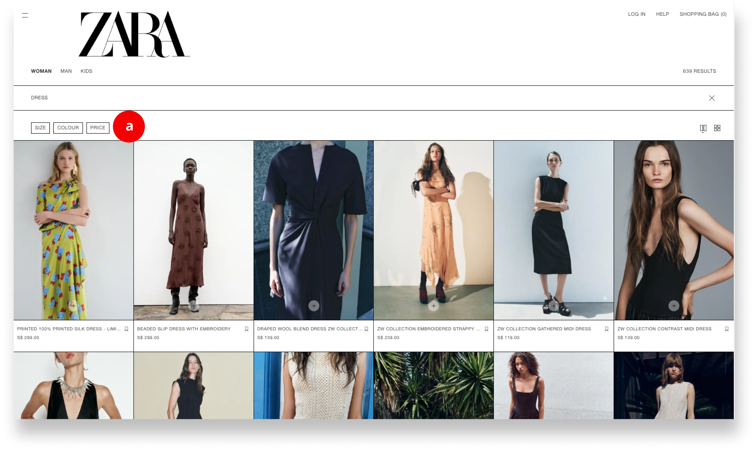
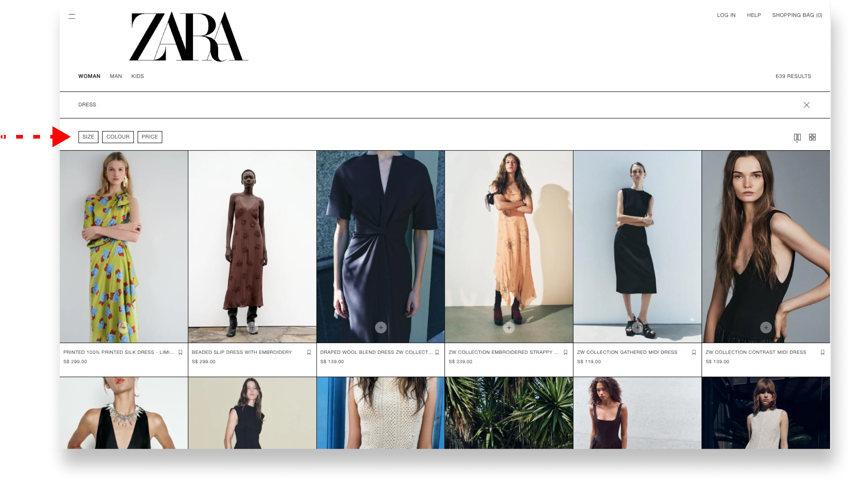
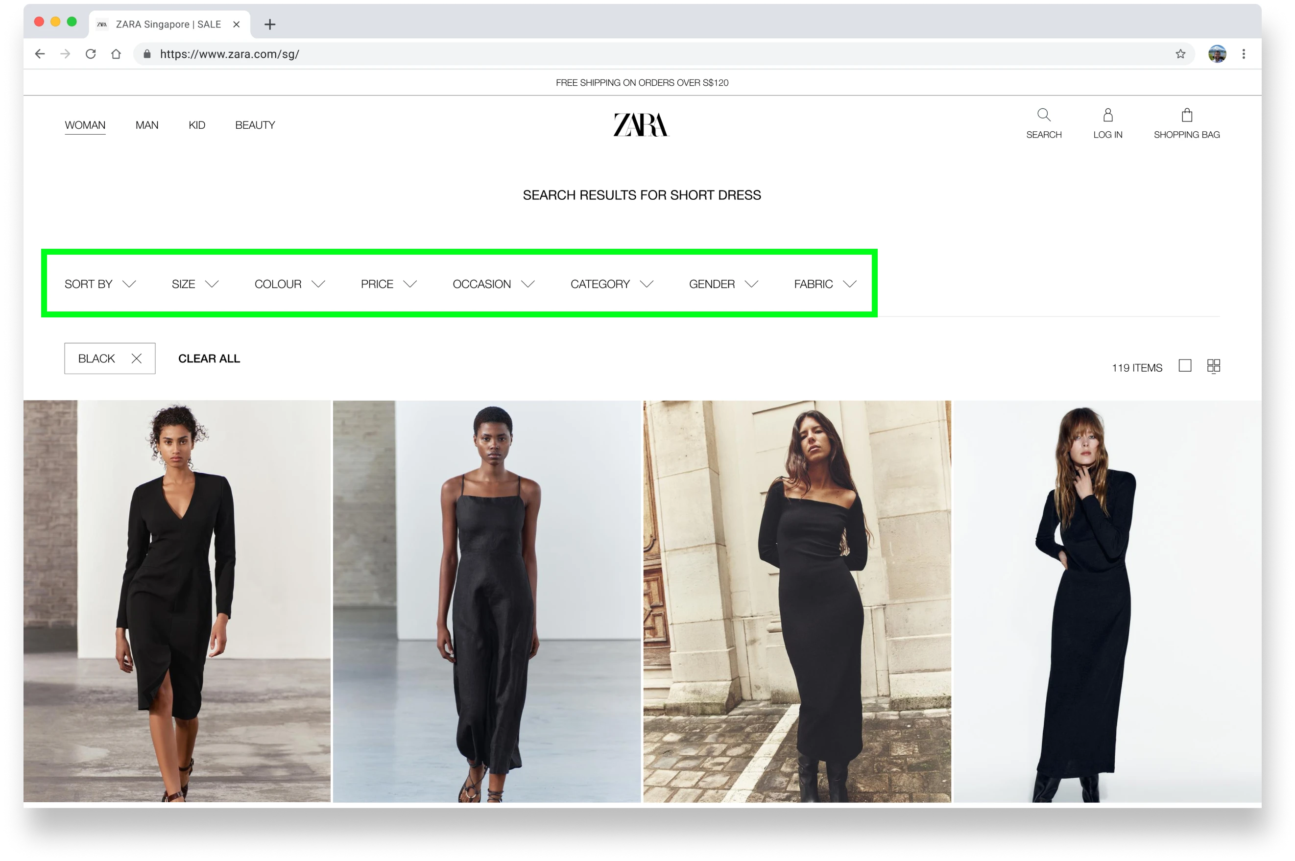
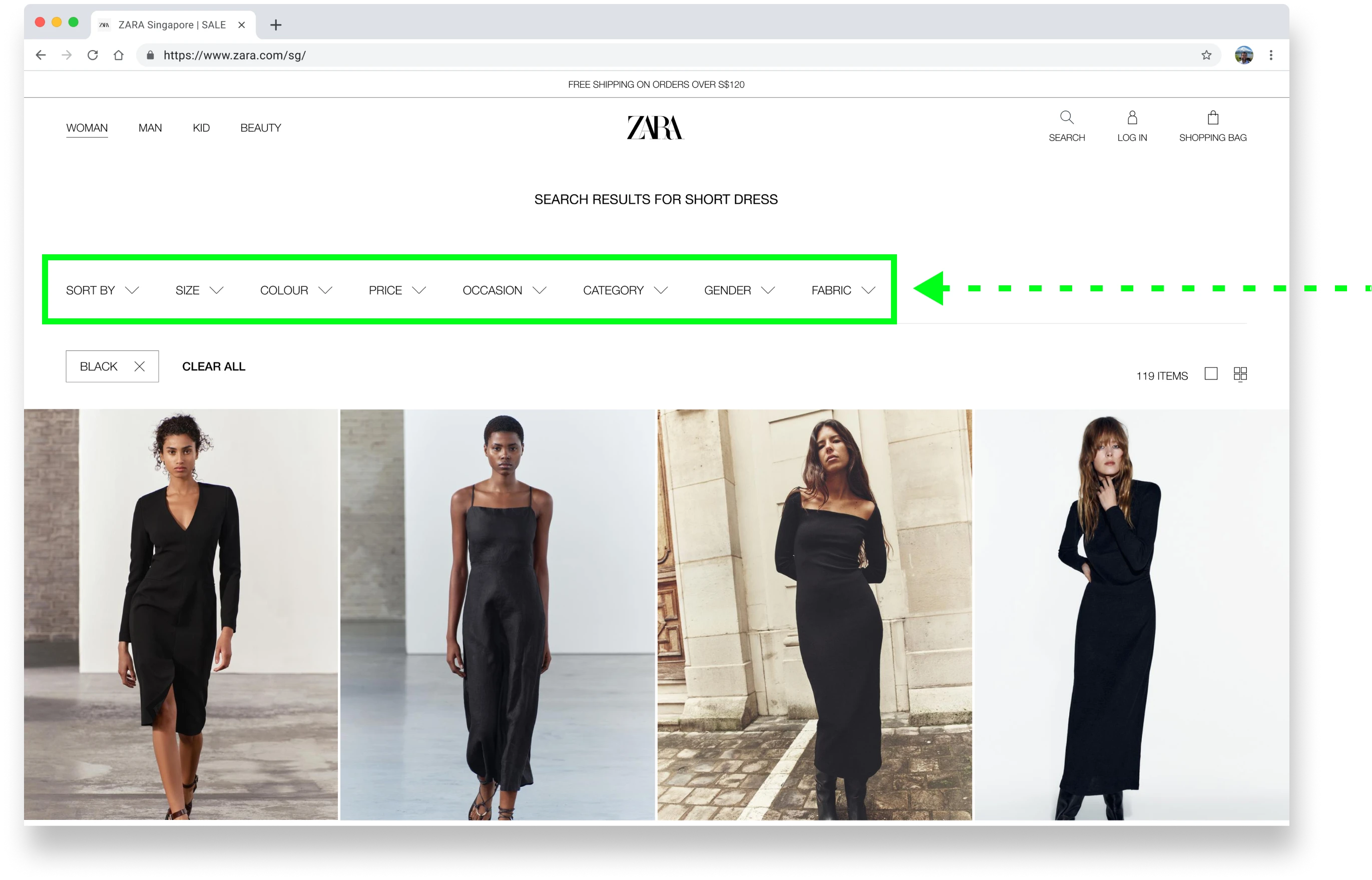
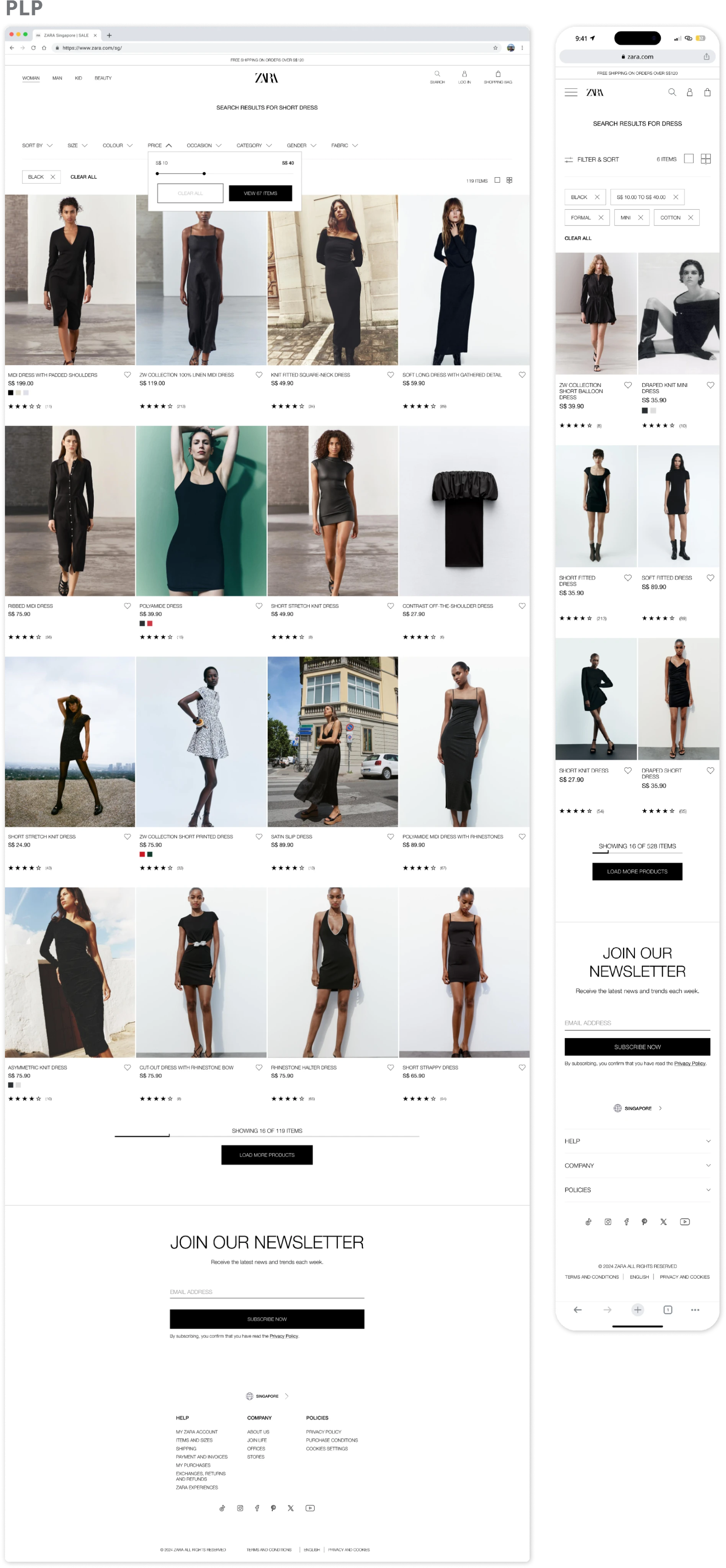
❌ Current Filter Limitations
❌ Current Filter Limitations
a) ❌ Current Filter Limitations
Limited to basic filters like size, color, and price, the existing site lacks the personalization users need to find exactly what they're looking for.
Limited to basic filters like size, color, and price, the existing site lacks the personalization users need to find exactly what they're looking for.
Limited to basic filters like size, color, and price, the existing site lacks the personalization users need to find exactly what they're looking for.
search + filter (before)
search + filter (before)
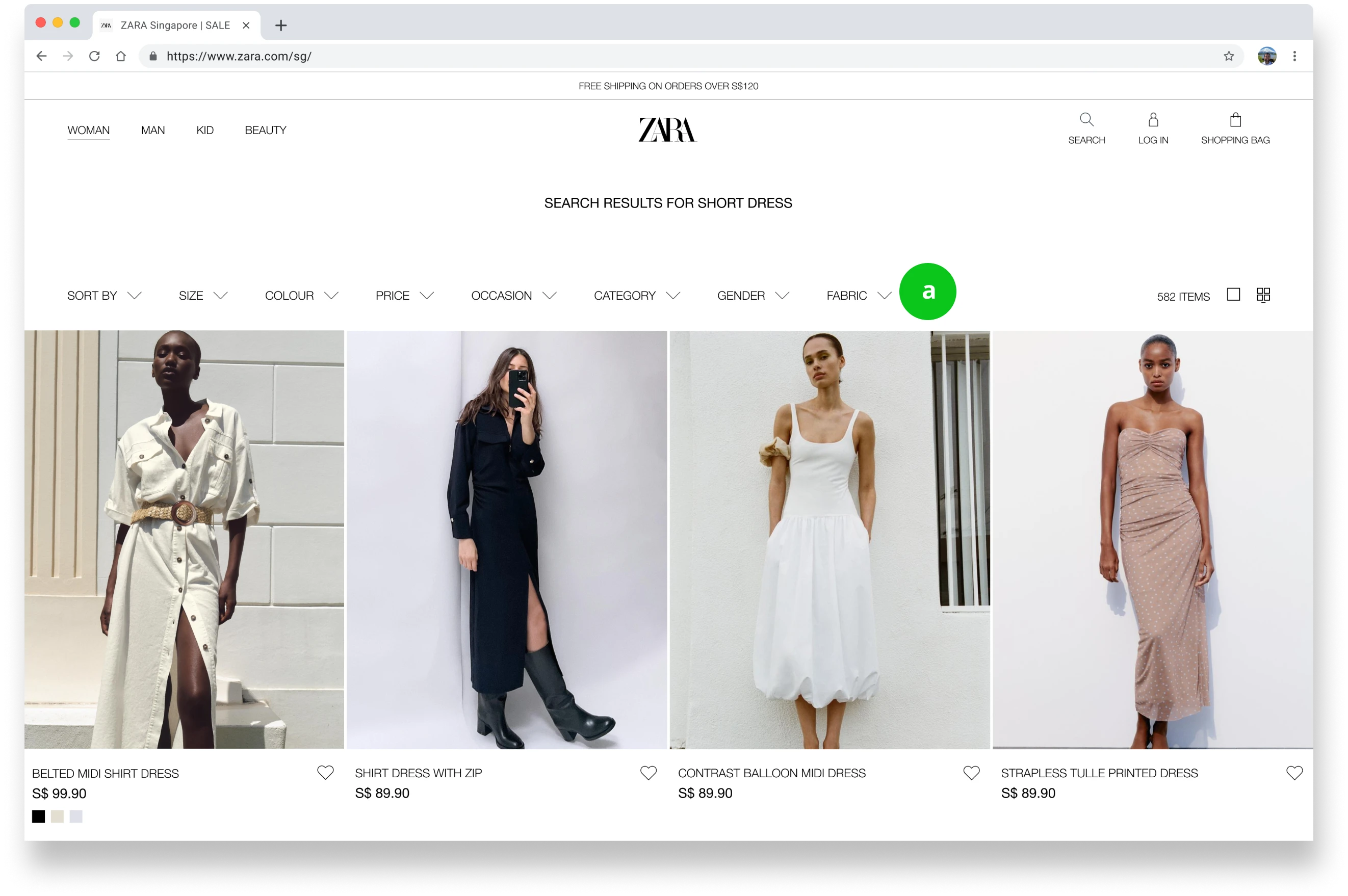
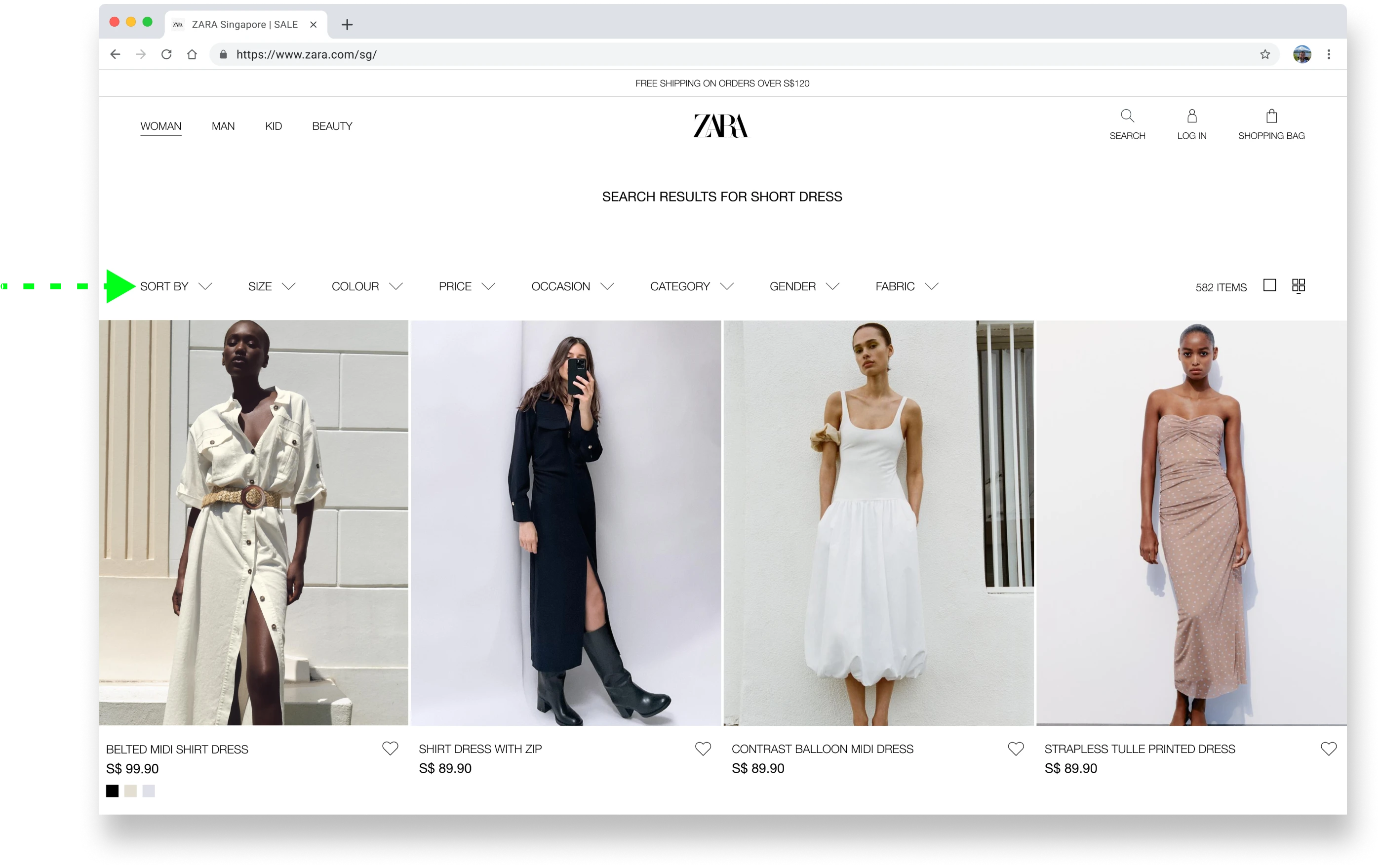
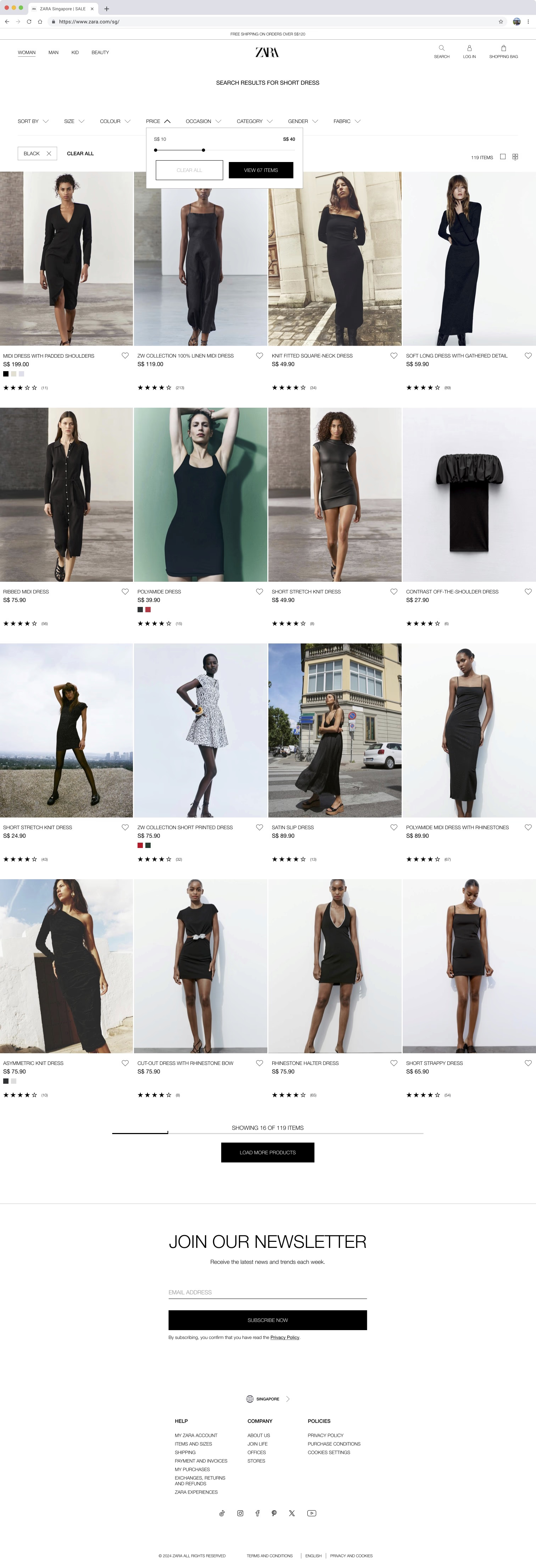
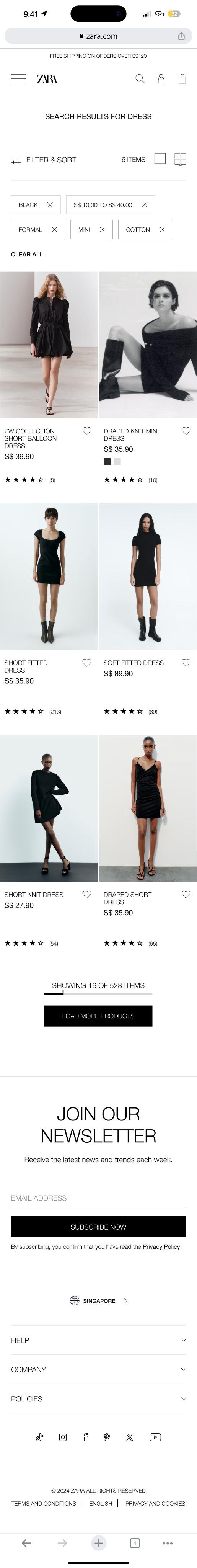
✅ Enhanced Filter Feature
✅ Enhanced Filter Feature
a) ✅ Enhanced Filter Feature
Introduced comprehensive filters, including occasion, category, and fabric, creating a more personalized & efficient search experience.
(Filter options were designed based on user research & common participants' preferences.)
Introduced comprehensive filters, including occasion, category, and fabric, creating a more personalized & efficient search experience.
(Filter options were designed based on user research & common participants' preferences.)
Introduced comprehensive filters, including occasion, category, and fabric, creating a more personalized & efficient search experience.
(Filter options were designed based on user research & common participants' preferences.)
search + filter (after)
search + filter (after)

Insightful
Insightful
Insightful
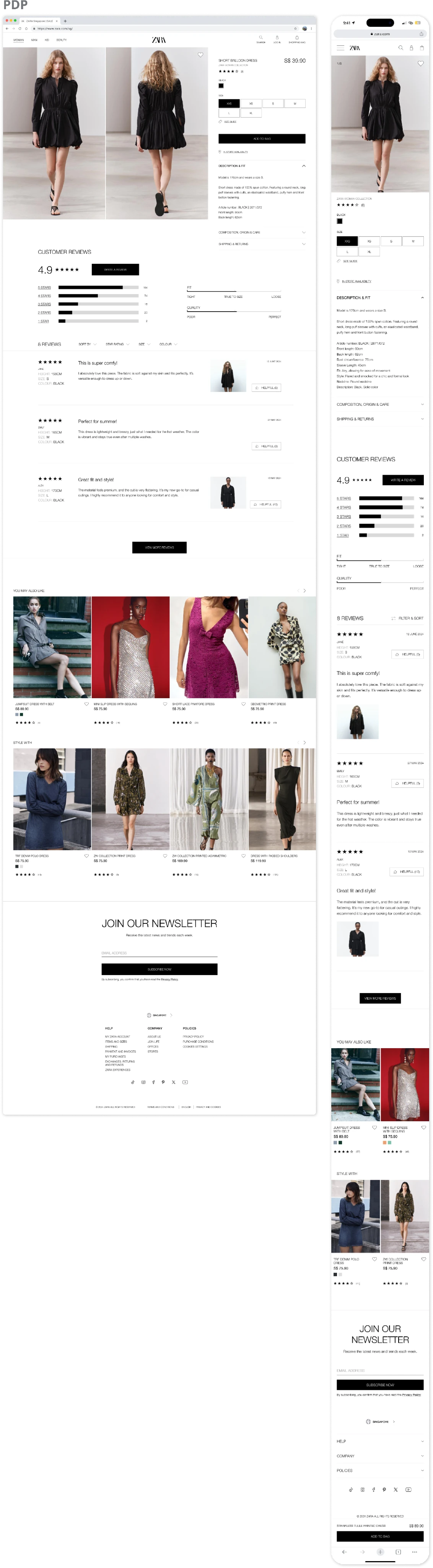
pdp (before)
pdp (before)
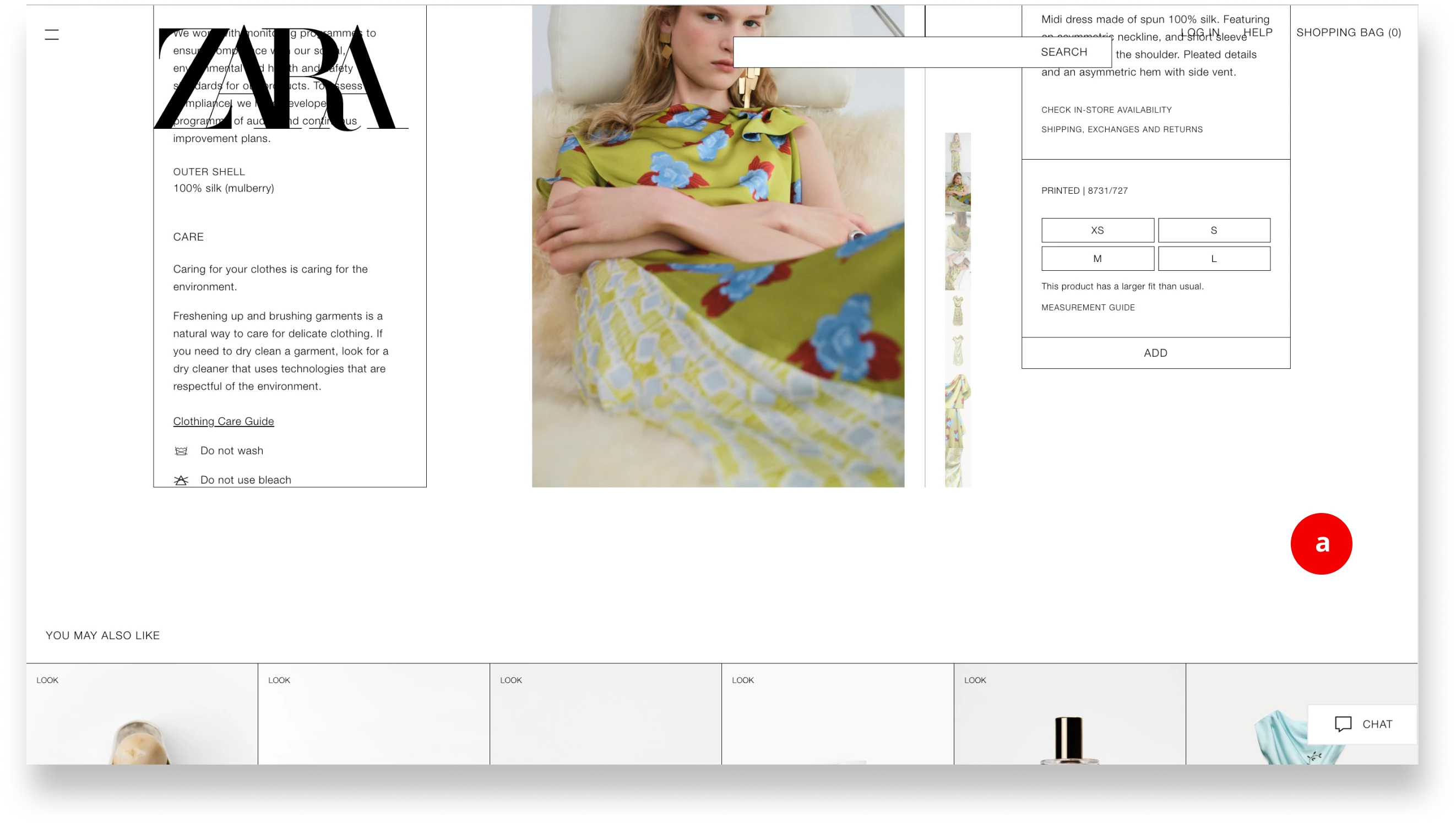
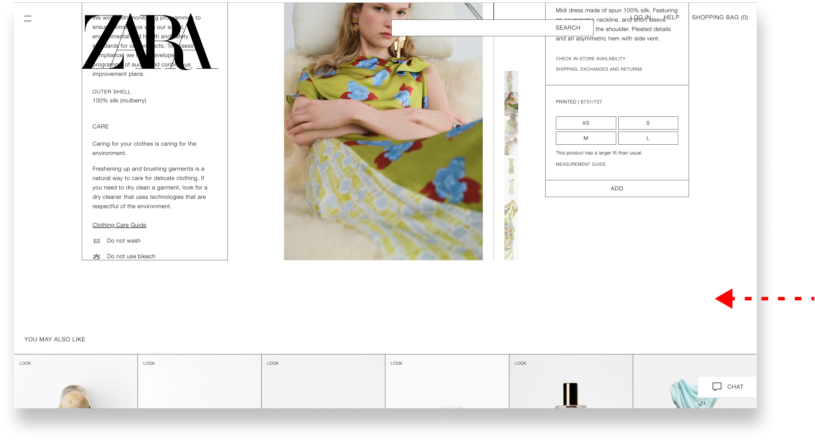
❌ Lack of Product Insights
❌ Lack of Product Insights
a) ❌ Lack of Product Insights
The existing site lacks customer feedback & fit information, leaving customers uncertain and unable to make fully informed purchase decisions.
The existing site lacks customer feedback & fit information, leaving customers uncertain and unable to make fully informed purchase decisions.
The existing site lacks customer feedback & fit information, leaving customers uncertain and unable to make fully informed purchase decisions.
pdp (after)
pdp (after)
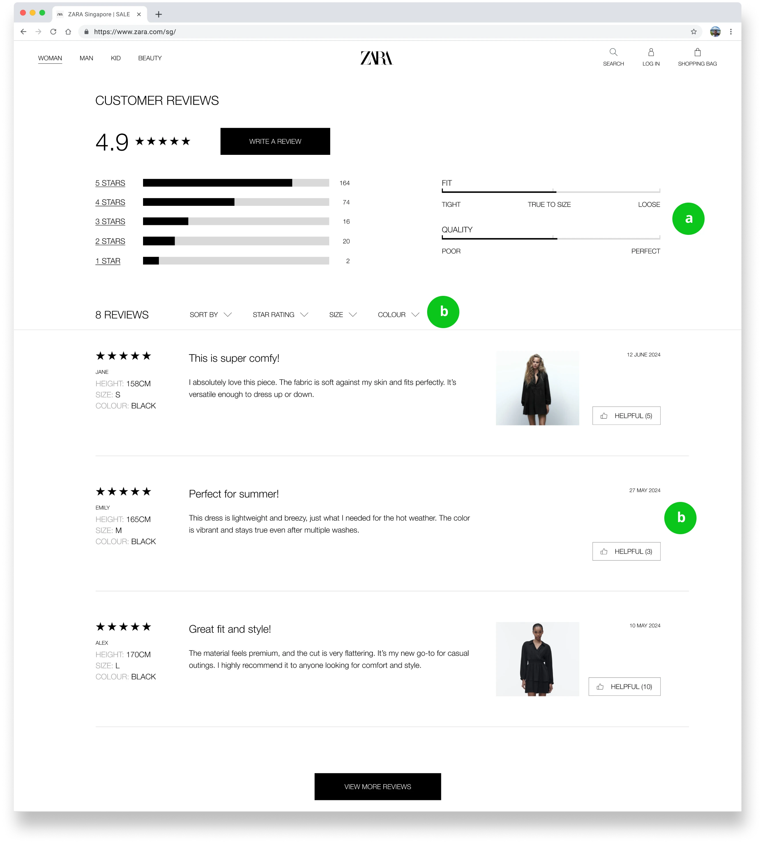
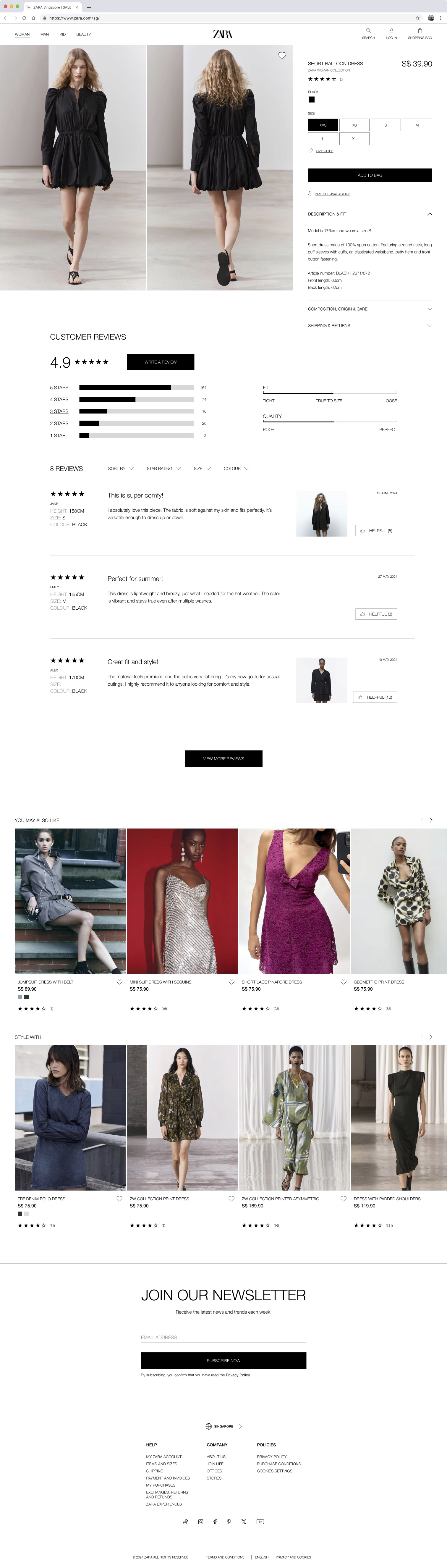
✅ Detailed Product Fit & Quality
✅ Detailed Product Fit & Quality
a) ✅ Detailed Product Fit & Quality
Introduced bars showing customers overall ratings on fit & quality, helping users make easier purchase decisions.
Introduced bars showing customers overall ratings on fit & quality, helping users make easier purchase decisions.
Introduced bars showing customers overall ratings on fit & quality, helping users make easier purchase decisions.
✅ Comprehensive Reviews Section
✅ Comprehensive Reviews Section
b) ✅ Comprehensive Reviews Section
Introduced a comprehensive reviews section with personalised filter options to help users make more informed decisions.
Introduced a comprehensive reviews section with personalised filter options to help users make more informed decisions.
Introduced a comprehensive reviews section with personalised filter options to help users make more informed decisions.
Early Ideation Process
Early Ideation Process
Early Ideation Process
Early Ideation Process
hold on! How did my analysis shape these solutions? 🤔
hold on! How did my analysis shape these solutions? 🤔
hold on! How did my analysis shape these solutions? 🤔
(check out the idea factory ⬇️)
(check out the idea factory ⬇️)
(check out the idea factory ⬇️)
(check out the idea factory ⬇️)
Competitive Analysis 📊
Competitive Analysis 📊
Competitive Analysis 📊
Competitive Analysis 📊
I began with a competitive analysis to evaluate how other brands handle similar challenges, uncovering key opportunities to improve Zara's online shopping experience.
I began with a competitive analysis to evaluate how other brands handle similar challenges, uncovering key opportunities to improve Zara's online shopping experience.
I began with a competitive analysis to evaluate how other brands handle similar challenges, uncovering key opportunities to improve Zara's online shopping experience.
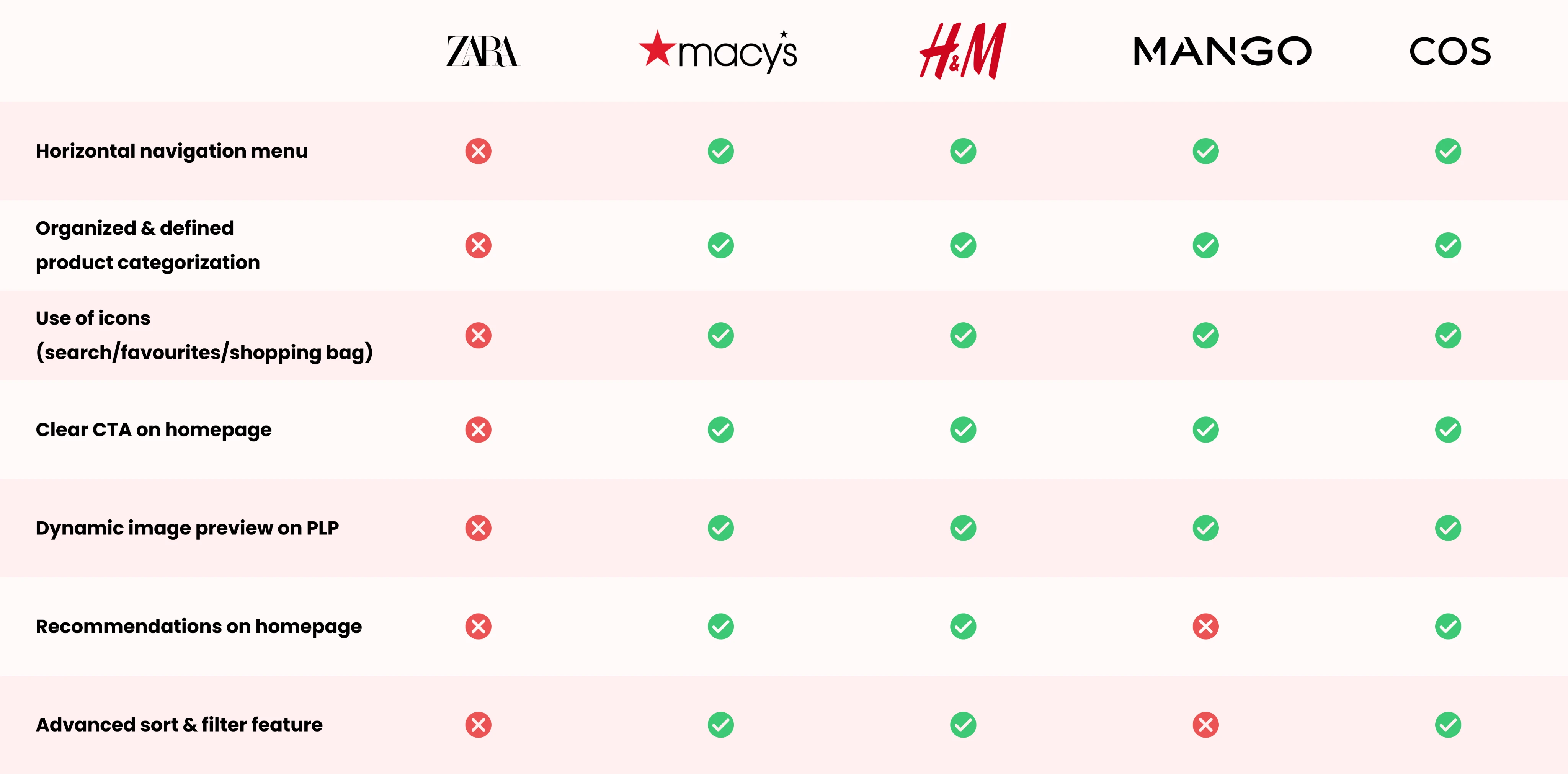
Key takeaways! 🔑
Key takeaways! 🔑
Key takeaways! 🔑
Enhance content hierarchy to improve readability & reduce cognitive overload.
Enhance content hierarchy to improve readability & reduce cognitive overload.
Enhance content hierarchy to improve readability & reduce cognitive overload.
Optimize page structure to make key information & functions more accessible.
Optimize page structure to make key information & functions more accessible.
Optimize page structure to make key information & functions more accessible.
Improve sort & filter functions to enhance the overall browsing experience.
Improve sort & filter functions to enhance the overall browsing experience.
Improve sort & filter functions to enhance the overall browsing experience.
Task Flows 🔁
Task Flows 🔁
Task Flows 🔁
Task Flows 🔁
I created task flows that were essential for testing my solutions within Zara's existing user flow, ensuring they integrated seamlessly & enhanced the overall experience.
I created task flows that were essential for testing my solutions within Zara's existing user flow, ensuring they integrated seamlessly & enhanced the overall experience.
I created task flows that were essential for testing my solutions within Zara's existing user flow, ensuring they integrated seamlessly & enhanced the overall experience.
Refining Typography 🔡
Refining Typography 🔡
Refining Typography 🔡
Zara's current typography lacks hierarchy, with small text sizes causing readability issues. I refined the existing type by adding new sizes while maintaining the same weight (light) to preserve brand identity & enhance hierarchy in the redesign.
Zara's current typography lacks hierarchy, with small text sizes causing readability issues. I refined the existing type by adding new sizes while maintaining the same weight (light) to preserve brand identity & enhance hierarchy in the redesign.
Zara's current typography lacks hierarchy, with small text sizes causing readability issues. I refined the existing type by adding new sizes while maintaining the same weight (light) to preserve brand identity & enhance hierarchy in the redesign.
Existing:
Existing:
Existing:
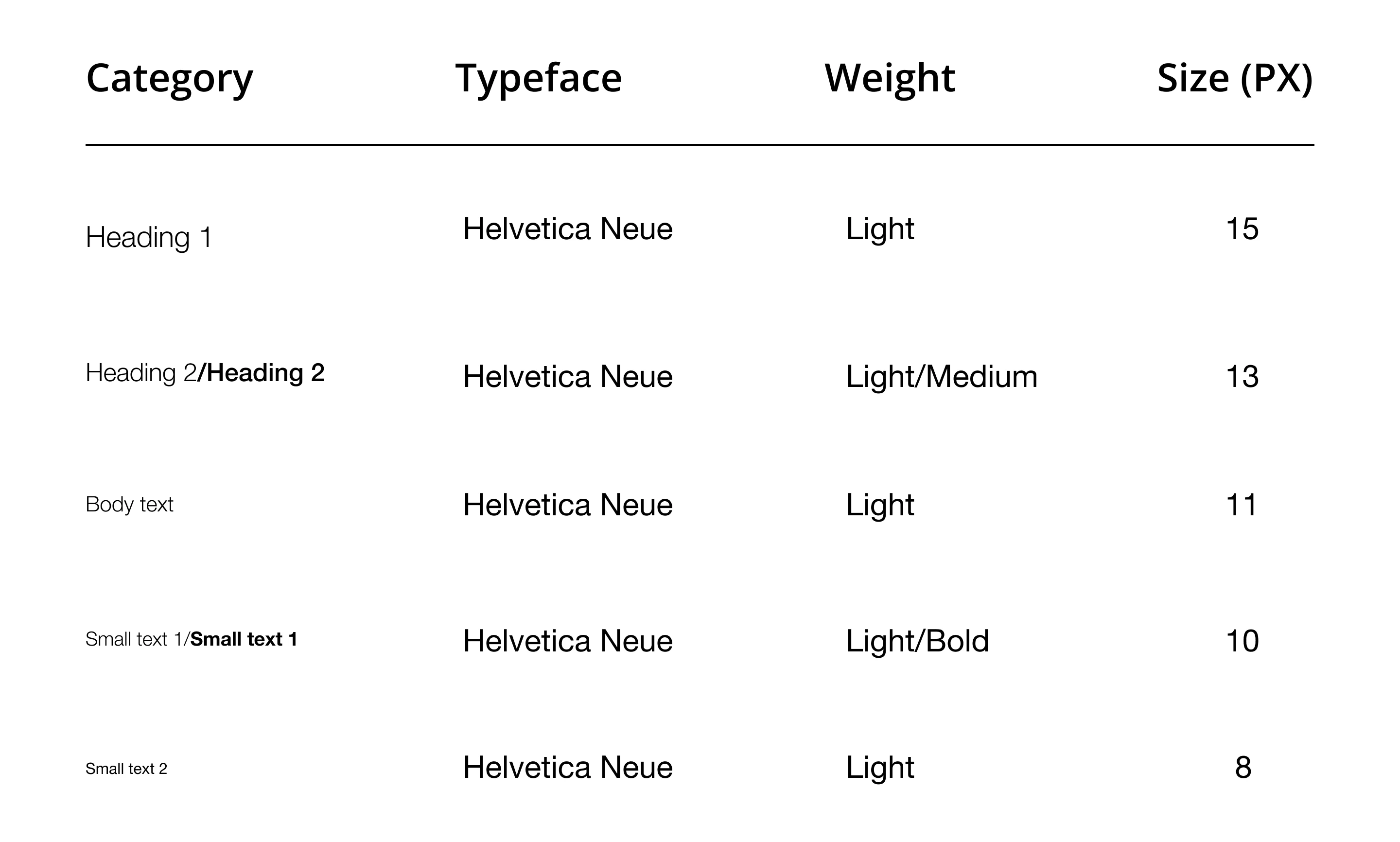
newly added:
newly added:
newly added:
99px
50px
26px
22px
16px

While shaping the wireframes…
While shaping the wireframes…
While shaping the wireframes…
I discovered a significant flaw in my design approach 😮
I discovered a significant flaw in my design approach 😮
I discovered a significant flaw in my design approach 😮
(and did something about it —details in the next section!) ⬇️)
(and did something about it —details in the next section!) ⬇️)
(and did something about it —details in the next section!) ⬇️)
❗️road block ahead❗️
❗️road block ahead❗️
❗️road block ahead❗️
what mistakes did i make? 🤔
what mistakes did i make? 🤔
what mistakes did i make? 🤔
what mistakes did i make? 🤔
(and how I recovered!)
(and how I recovered!)
(and how I recovered!)
(and how I recovered!)
I assumed UI components from top eCommerce brands would instantly work for my designs too.
I assumed UI components from top eCommerce brands would instantly work for my designs too.
I assumed UI components from top eCommerce brands would instantly work for my designs too.
I soon realized I was off track & wasting my time to be pixel-perfect, & needed to shift my focus from replicating perfect designs, to truly enhancing the user experience:
I soon realized I was off track & wasting my time to be pixel-perfect, & needed to shift my focus from replicating perfect designs, to truly enhancing the user experience:
I soon realized I was off track & wasting my time to be pixel-perfect, & needed to shift my focus from replicating perfect designs, to truly enhancing the user experience:
Mid-fi v1:
Mid-fi v1:
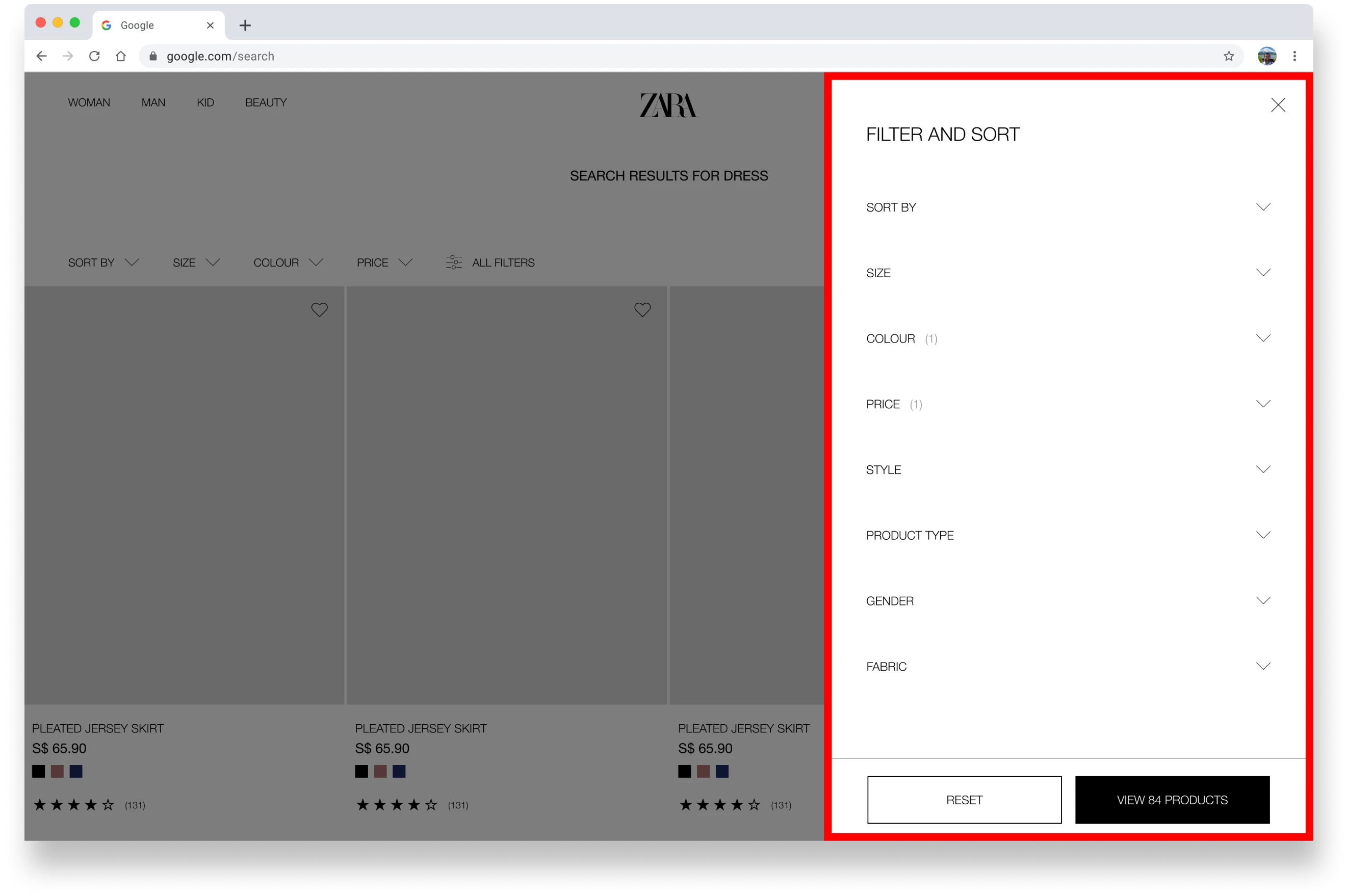
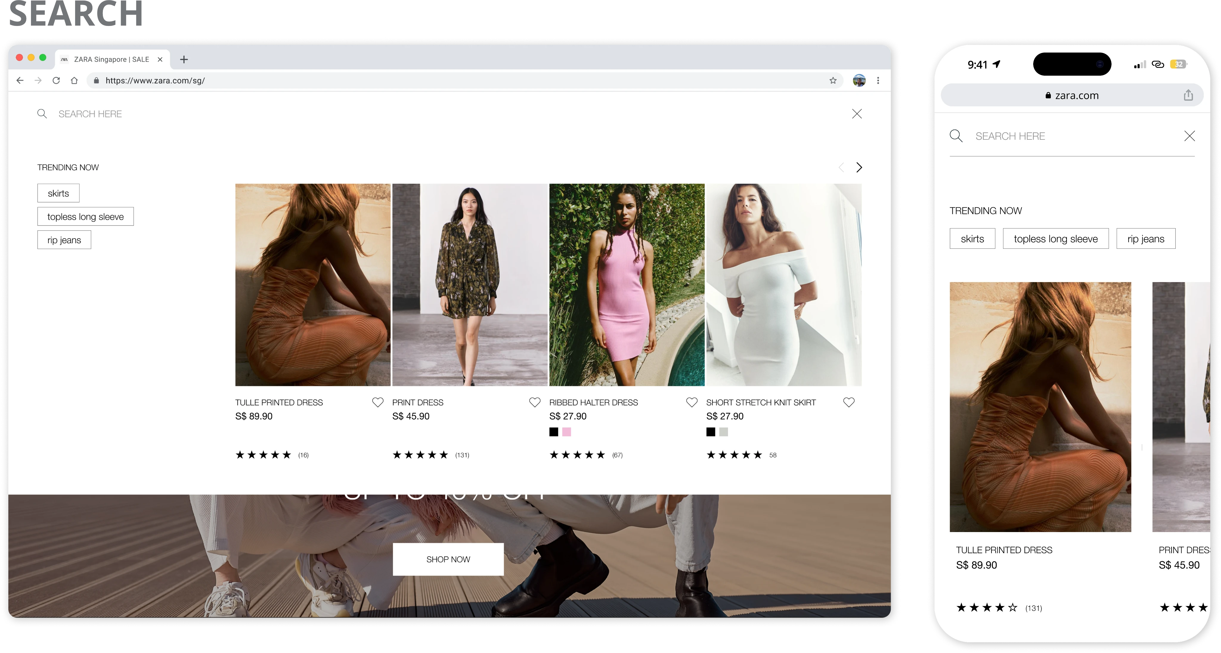
After analyzing top brands like IKEA, COS & H&M, I initially believed that placing all filter options in a right-side pop-up modal like they did would guarantee a flawless user experience.
But quickly realized I was wrong! 🙅♀️
After analyzing top brands like IKEA, COS & H&M, I initially believed that placing all filter options in a right-side pop-up modal like they did would guarantee a flawless user experience.
But quickly realized I was wrong! 🙅♀️
❌ After analyzing top brands like IKEA, COS & H&M, I initially believed that placing all filter options in a right-side pop-up modal like they did would guarantee a flawless user experience.
But quickly realized I was wrong! 🙅♀️
📝 After a quick user test… 📝
📝 After a quick user test… 📝
📝 After a quick user test… 📝
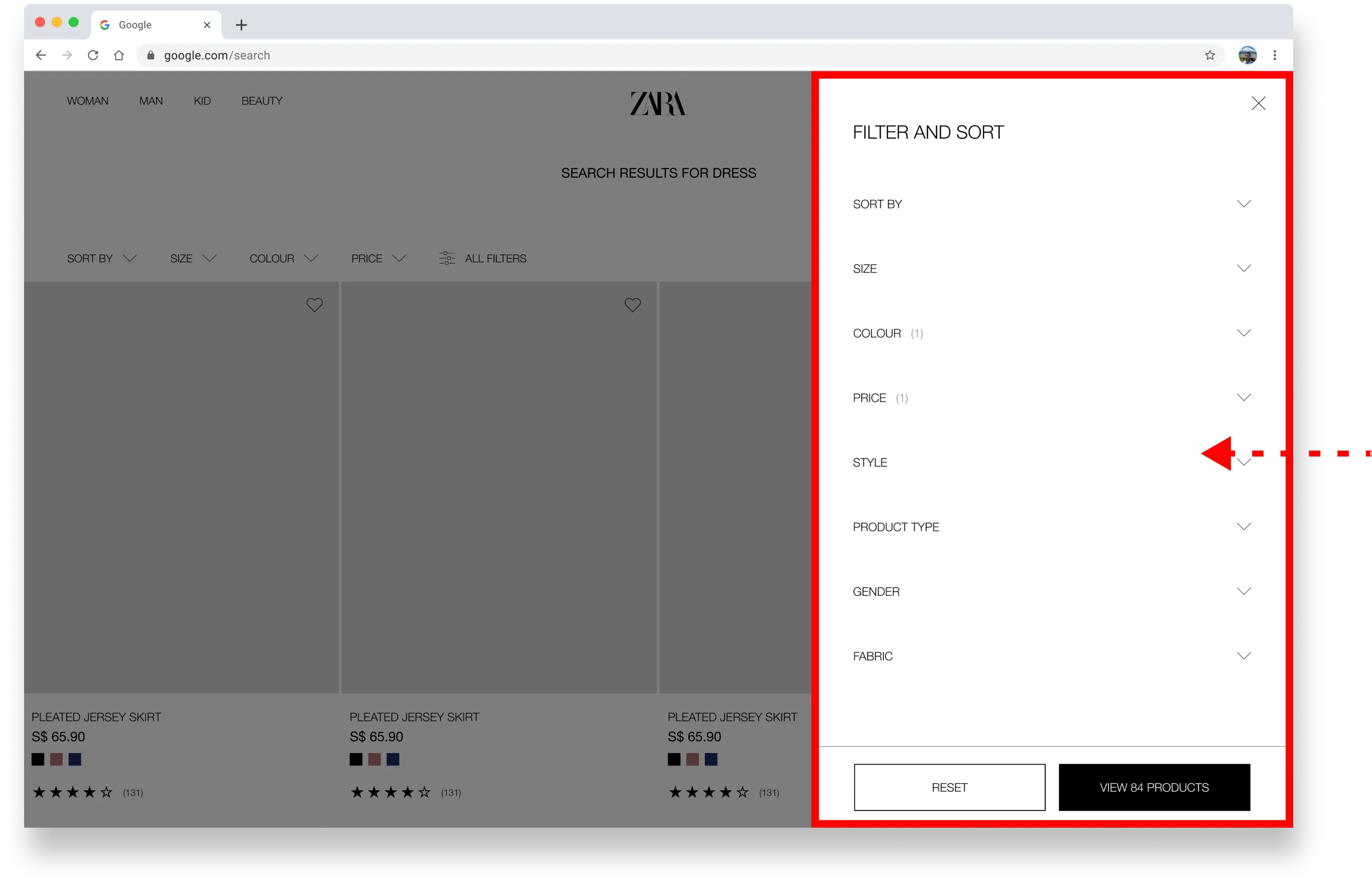
final hi-fi:
final hi-fi:
I discovered that the pop-up modal was unnecessary, as Zara’s redesign required only 7 filter options, unlike brands like IKEA and H&M with over 15.
To enhance the user experience, I removed the modal & placed all filters directly on the PLP page for easier access.
I discovered that the pop-up modal was unnecessary, as Zara’s redesign required only 7 filter options, unlike brands like IKEA and H&M with over 15.
To enhance the user experience, I removed the modal & placed all filters directly on the PLP page for easier access.
✅ I discovered that the pop-up modal was unnecessary, as Zara’s redesign required only 7 filter options, unlike brands like IKEA and H&M with over 15.
To enhance the user experience, I removed the modal & placed all filters directly on the PLP page for easier access.
Putting it to the Test
Putting it to the Test
Putting it to the Test
Putting it to the Test
how did i measure design success 👍?
how did i measure design success 👍?
how did i measure design success 👍?
I tested my designs' impact through usability testing on 11 participants, focusing on 3 task flows.
I tested my designs' impact through usability testing on 11 participants, focusing on 3 task flows.
I tested my designs' impact through usability testing on 11 participants, focusing on 3 task flows.
🔖 TASK FLOWS
🔖 TASK FLOWS
🔖 TASK FLOWS
Look for a specific product via the search + filter feature.
Look for a specific product via the search + filter feature.
Look for a specific product via the search + filter feature.
Evaluate product fit info & adjust reviews preferences using filter feature.
Evaluate product fit info & adjust reviews preferences using filter feature.
Evaluate product fit info & adjust reviews preferences using filter feature.
Add selected product to cart.
Add selected product to cart.
Add selected product to cart.
🔍 FINDINGS
🔍 FINDINGS
🔍 FINDINGS
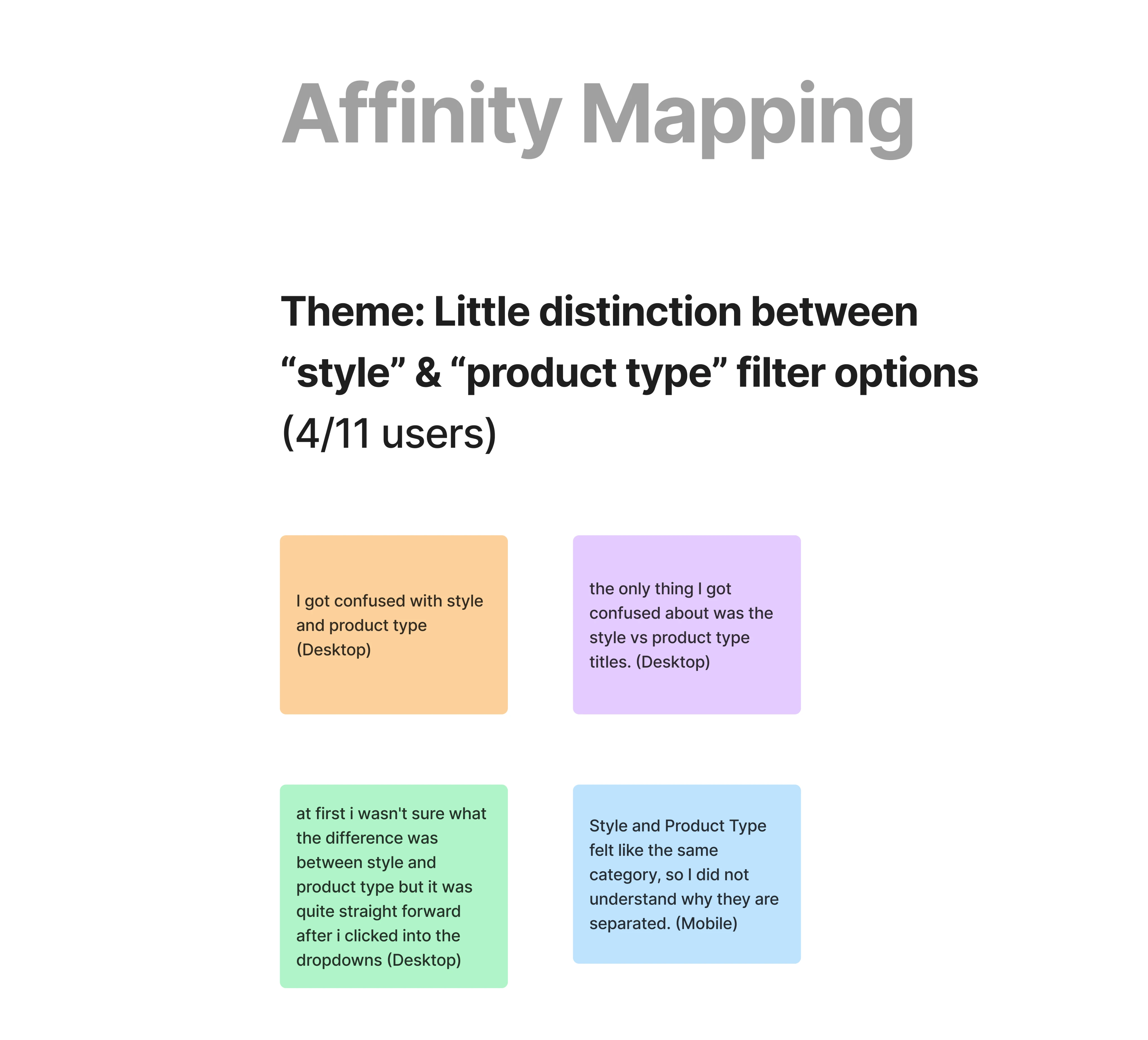
The prototype test showed a strong CSAT of 92%, indicating high satisfaction with Zara's redesign.
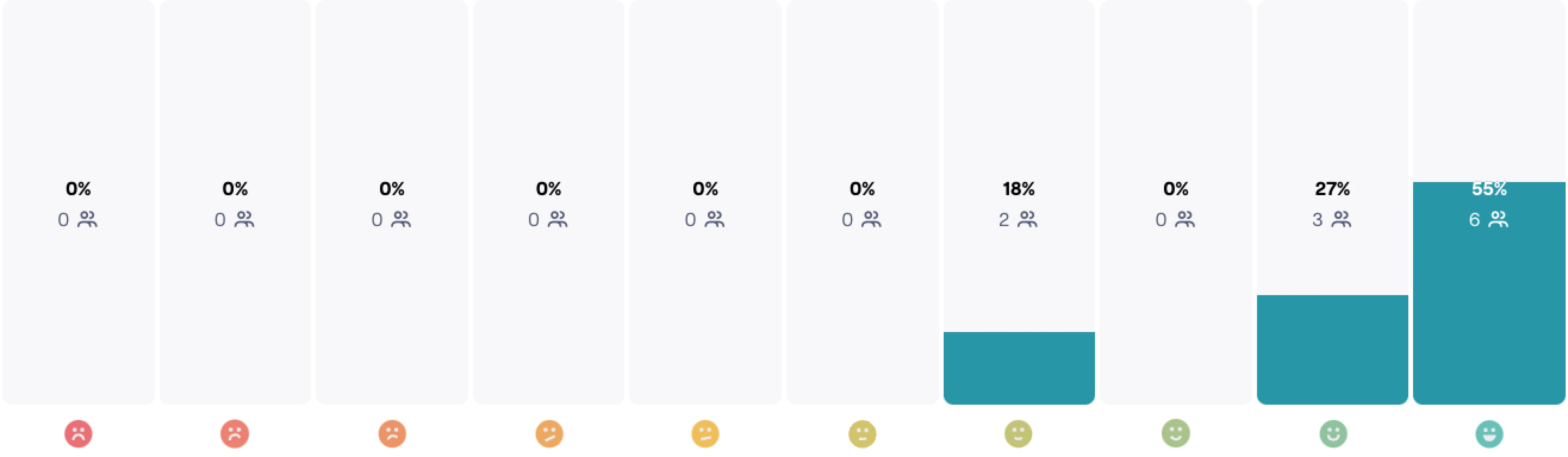
However, 36% of users were confused between the definitions of 2 filter options: Style & Product Type❗️
To address this, I conducted affinity mapping to identify root causes & iterate on solutions.
The prototype test showed a strong CSAT of 92%, indicating high satisfaction with Zara's redesign.
However, 36% of users were confused between the definitions of 2 filter options: Style & Product Type❗️
To address this, I conducted affinity mapping to identify root causes & iterate on solutions.
The prototype test showed a strong CSAT of 92%, indicating high satisfaction with Zara's redesign.
However, 36% of users were confused between the definitions of 2 filter options: Style & Product Type❗️
To address this, I conducted affinity mapping to identify root causes & iterate on solutions.
(click to expand)
(click to expand)
Excellent Customer Satisfaction Score (CSAT) 🤩
Excellent Customer Satisfaction Score (CSAT) 🤩
Excellent Customer Satisfaction Score (CSAT) 🤩
prioritized iterations · how i made it better 🙂
prioritized iterations · how i made it better 🙂
prioritized iterations · how i made it better 🙂
prioritized iterations · how i made it better 🙂
Design Revision
Design Revision
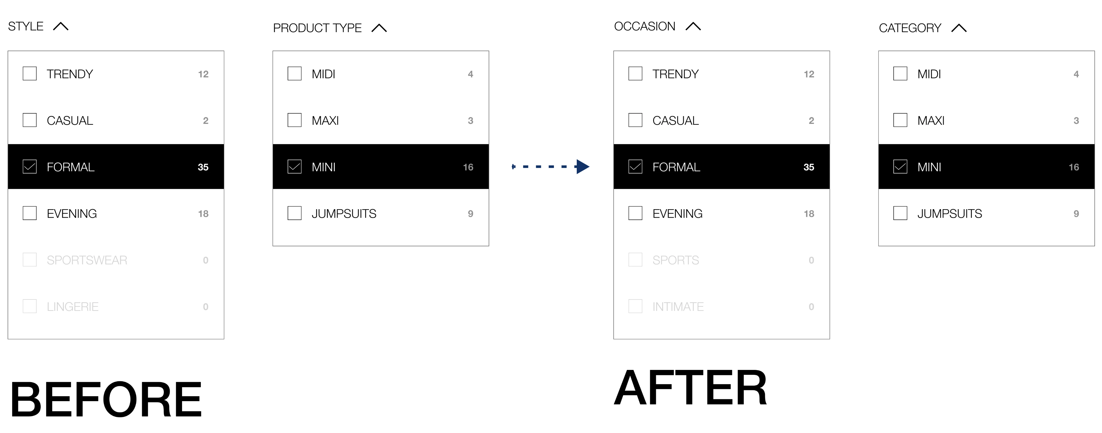
I introduced 2 new sets of filter pairings & conducted a quick A/B test with a new set of users to determine which pair of labels resonated most.
I introduced 2 new sets of filter pairings & conducted a quick A/B test with a new set of users to determine which pair of labels resonated most.
1. Style & Product Type (Original) ❌
2. Occasion & Category (Winner! 🏆) ✅
3. Occasion & Style ❌
1. Style & Product Type (Original) ❌
2. Occasion & Category (Winner! 🏆) ✅
3. Occasion & Style ❌
Design Revision
I introduced 2 new sets of filter pairings & conducted a quick A/B test with a new set of users to determine which pair of labels resonated most.
1. Style & Product Type (Original) ❌
2. Occasion & Category (Winner! 🏆) ✅
3. Occasion & Style ❌
✨ the FINAL DESIGNS ✨
✨ the FINAL DESIGNS ✨
✨ the FINAL DESIGNS ✨
✨ the FINAL DESIGNS ✨
(Wait! Did I make it responsive? Yes, yes I did ⬇️)
(Wait! Did I make it responsive? Yes, yes I did ⬇️)
(Wait! Did I make it responsive? Yes, yes I did ⬇️)
(Wait! Did I make it responsive? Yes, yes I did ⬇️)
Ready to explore? Dive in & interact with our product now! 💻
Ready to explore? Dive in & interact with our product now! 💻
Ready to explore? Dive in & interact with our product now! 💻
(Pages within the device are scrollable)
(Pages within the device are scrollable)
(scroll down to view pages)
homepage
Search (Whoops! Looks like this one's not scrollable.)


Plp
PDP

Closing Thoughts
Closing Thoughts
Closing Thoughts
Closing Thoughts
how did the problems influence the final designs? 💭
how did the problems influence the final designs? 💭
how did the problems influence the final designs? 💭
how did the problems influence the final designs? 💭
In summary....
In summary....
In summary....
Clear Navigation
Clear Navigation
Clear Navigation
Effortlessly browse and shop with clear navigation and personalized touches that make finding what you need a breeze.
Effortlessly browse and shop with clear navigation and personalized touches that make finding what you need a breeze.
Effortlessly browse and shop with clear navigation and personalized touches that make finding what you need a breeze.
Comprehensive filter options
Comprehensive filter options
Comprehensive filter options
Looking for something specific? Tailored filter options help you quickly discover exactly what you’re after.
Looking for something specific? Tailored filter options help you quickly discover exactly what you’re after.
Looking for something specific? Tailored filter options help you quickly discover exactly what you’re after.
Transparent Information
Transparent Information
Transparent Information
Get the details you need to shop confidently, with helpful product fit details & genuine user feedback right at your fingertips.
Get the details you need to shop confidently, with helpful product fit details & genuine user feedback right at your fingertips.
Get the details you need to shop confidently, with helpful product fit details & genuine user feedback right at your fingertips.
Reflection… 💭
Reflection… 💭
Reflection… 💭
🕖 If I had more time…
🕖 If I had more time…
🕖 If I had more time…
I would have delved even deeper into user research, specifically focusing on how users interpret & group certain words, & how they categorize them under different labels for the filter feature.
I would have delved even deeper into user research, specifically focusing on how users interpret & group certain words, & how they categorize them under different labels for the filter feature.
I would have delved even deeper into user research, specifically focusing on how users interpret & group certain words, & how they categorize them under different labels for the filter feature.
🧩 Design isn't a one-size-fit-all solution
🧩 Design isn't a one-size-fit-all solution
🧩 Design isn't a one-size-fit-all solution
Just because a design approach works for other brands doesn’t mean it will work for mine. This reminded me that a perfect design doesn’t always mean a great user experience, & I need to focus on what truly benefits the user.
Just because a design approach works for other brands doesn’t mean it will work for mine. This reminded me that a perfect design doesn’t always mean a great user experience, & I need to focus on what truly benefits the user.
Just because a design approach works for other brands doesn’t mean it will work for mine. This reminded me that a perfect design doesn’t always mean a great user experience, & I need to focus on what truly benefits the user.
📄 Content! Is! Everything!
📄 Content! Is! Everything!
📄 Content! Is! Everything!
While designing the sort & filter feature, I realized how crucial content (UX writing) is. Finding the right wording & labels is challenging because different users interpret words differently. This experience emphasized the importance of clear, thoughtful content in creating effective features.
While designing the sort & filter feature, I realized how crucial content (UX writing) is. Finding the right wording & labels is challenging because different users interpret words differently. This experience emphasized the importance of clear, thoughtful content in creating effective features.
While designing the sort & filter feature, I realized how crucial content (UX writing) is. Finding the right wording & labels is challenging because different users interpret words differently. This experience emphasized the importance of clear, thoughtful content in creating effective features.